
Brand identity, stationery and website I designed for The Office Sutherland, a modern office space in the heart of Sutherland (Sydney) which uses sustainable, eco-friendly construction.
The client envisaged a premium, modern and sophisticated identity, which also reflected the building’s green credentials. They requested the logo be able to be re-used for subsequent developments (i.e. The Office Chatswood, The Office Surry Hills, etc.).
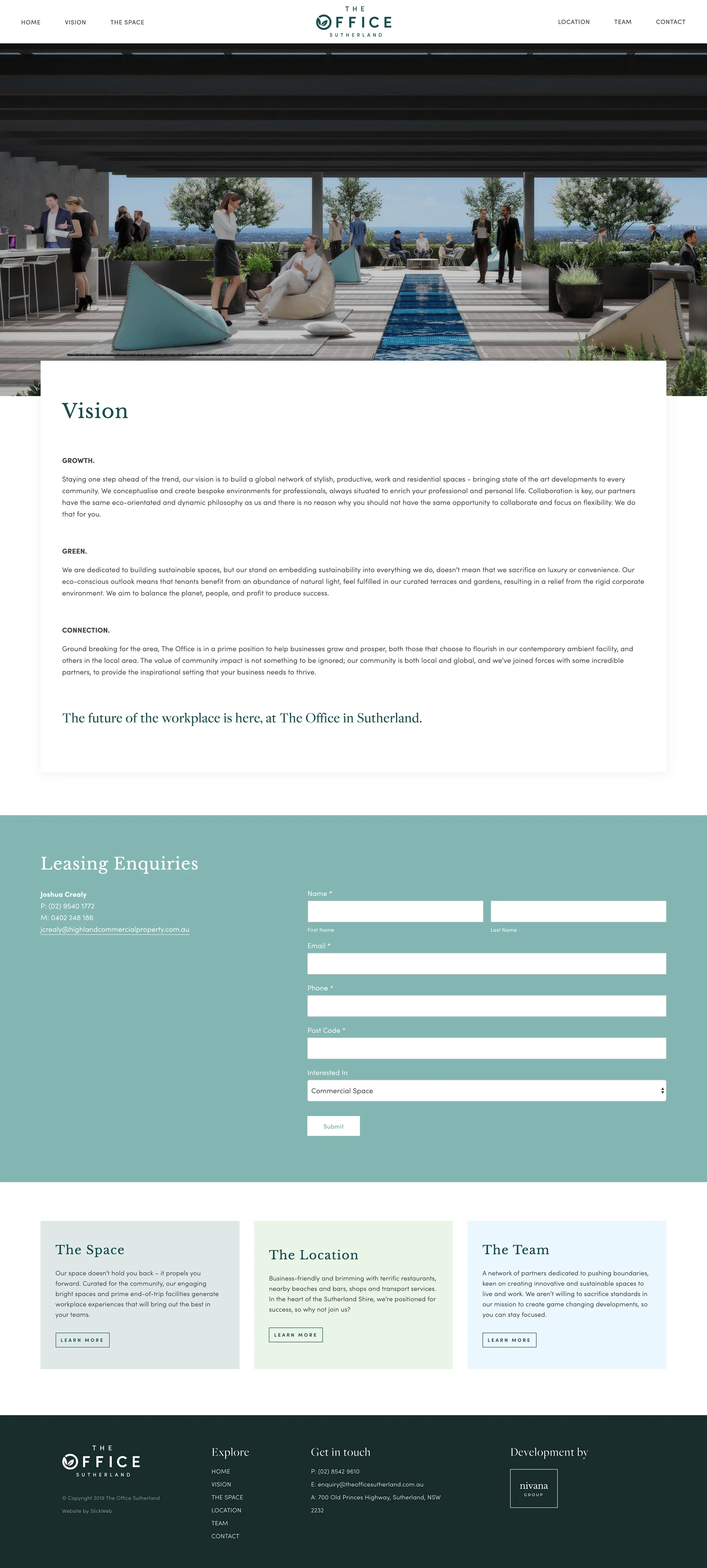
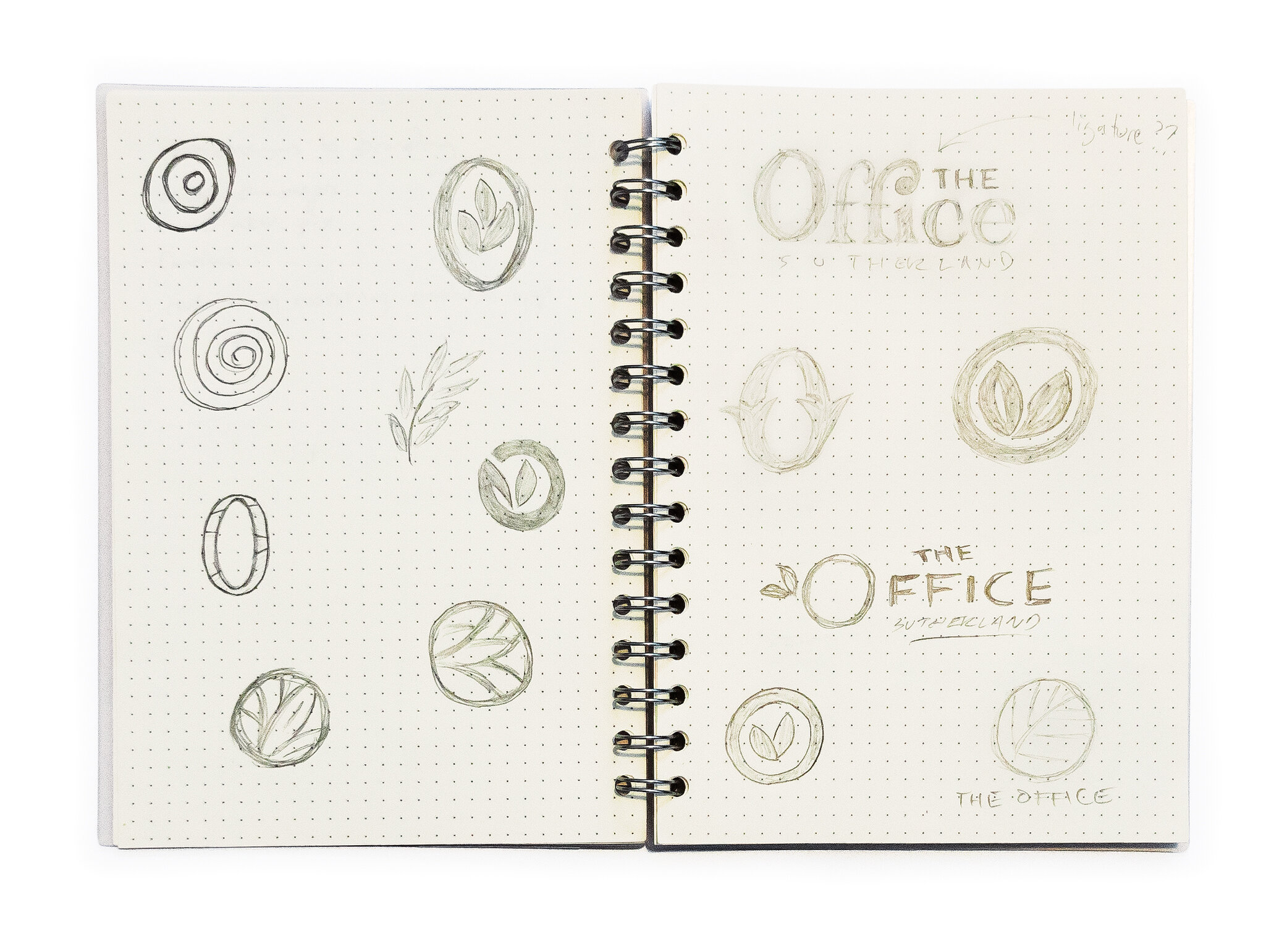
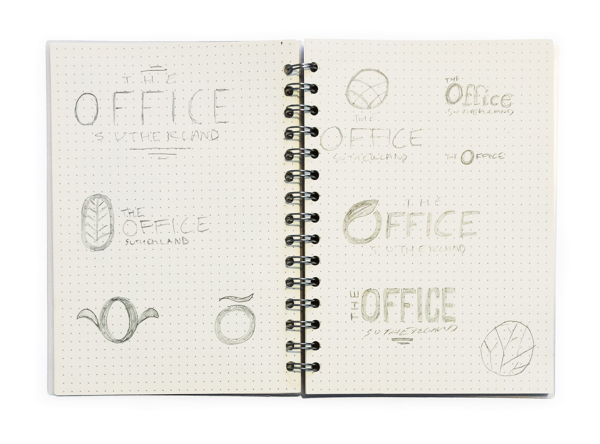
The final logo uses a stylised O icon with leaves arcing gracefully inside itself. This O icon can be used as a stand-alone brand element. The logo can also be used in multiple formats: portrait version with the O icon centred above the logotype, or landscape version with the O icon utilised as part of the logotype itself. These can both be used with (or without) the location strap-line - giving the client maximum flexibility.
A subdued palette of pastel and darker greens is paired with elegant sans serif typography to meet the client’s expectations of premium, green modernity. I designed the website in Sketch, and it was built in Squarespace by Sydney agency Slickweb (who commissioned me to design the whole project).
You can see some other projects I designed for Slickweb here and here.
Client: The Office Sutherland (Australia).
Designed remotely from Perth for Slickweb, 2019.
Mobile website: Location
Full stationery set


Desktop website: Vision
Desktop website: The Space
Signage concepts
PROJECT TAGS:
Slickweb rebrand
Tomi Björck
If you like this project, then say hello and let’s see what I can do to help you.