
Slickweb rebrand
Slickweb is a Sydney-based creative agency that I had been working with for a good part of 2018-19. In 2019 the agency’s director Pedro Santos approached me to completely redesign their brand identity, website and marketing material.
We worked together closely through the whole project, with our first step being extensive research and brainstorming of ideas for the visual direction we wanted to take the brand. The new logo is designed with flexibility in mind – it can be used with the S icon as a stand-alone mark, or with the full Slickweb logotype. The icon works in full colour, or reversed in an outline form. Animation was always forefront in our thoughts – the outlined version of the icon being ideally suited to an animated treatment.
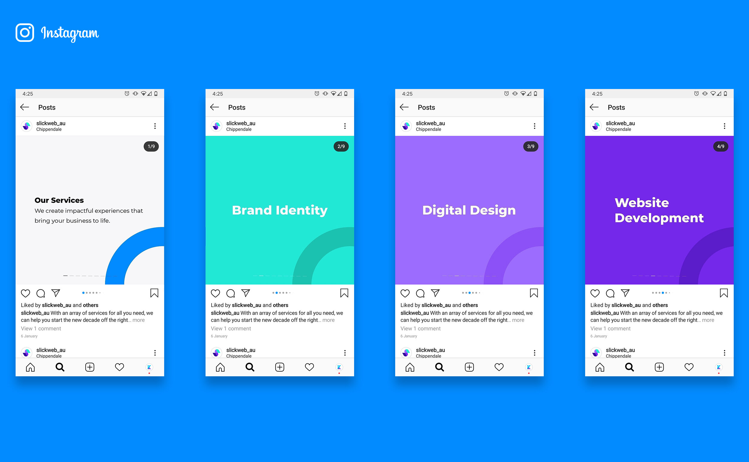
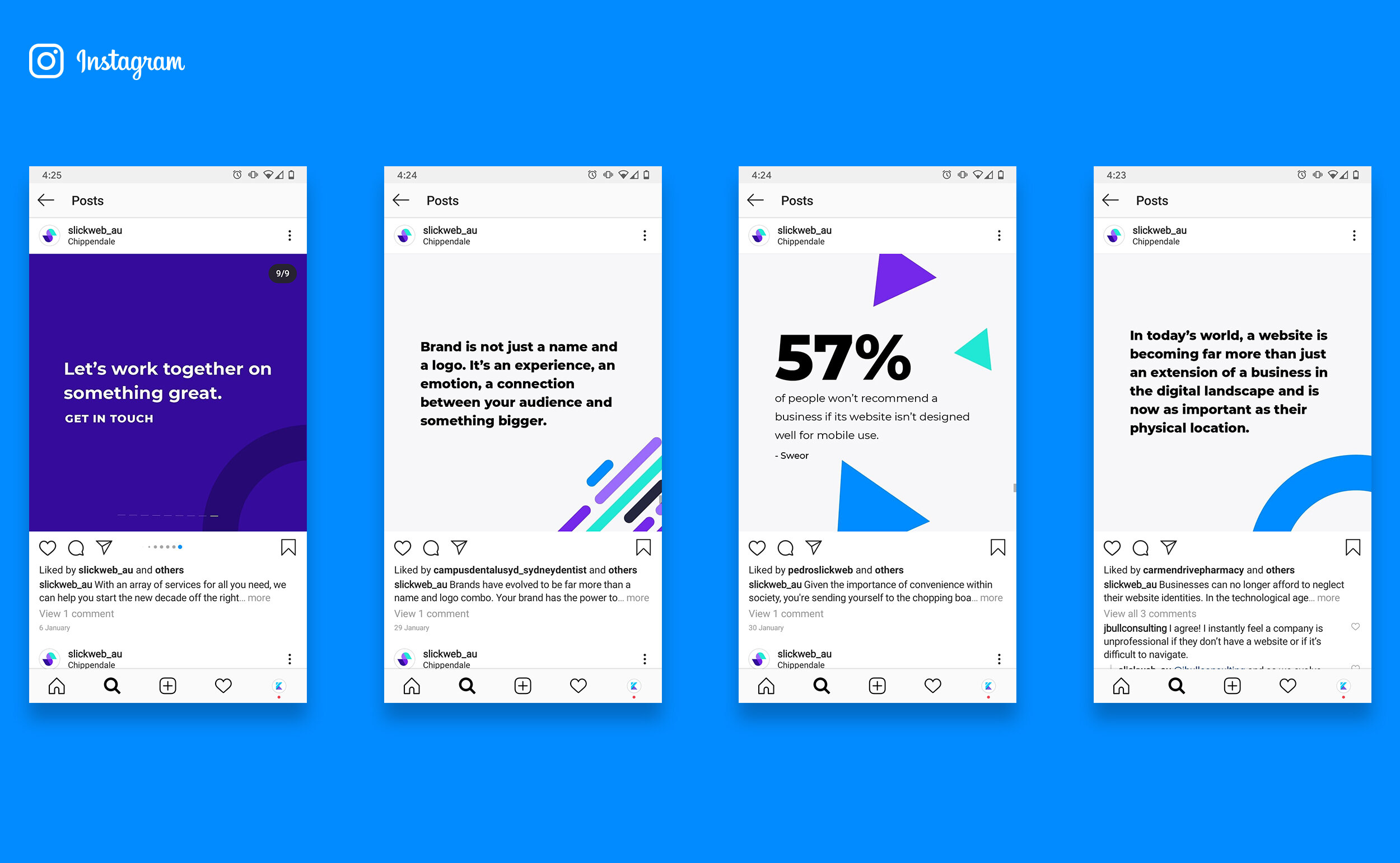
The new brand identity retains the purple colour scheme to maintain a visual link to their past. The bright, vibrant colour-scheme is a strong feature throughout the website, stationery and marketing material. Typography is treated as a design feature, with large bold headlines contrasting in scale against smaller design elements on the website, Instagram posts and other touch points.
Abstract, geometric shapes are used throughout the branding to create a fun, playful look and feel. The geometric shapes are utilised with rich, scroll-triggered animation throughout the website (in place of the textures and photo-heavy design of the old version). I designed the website concepts in Sketch, with Slickweb bringing them to life in Squarespace with some really creative use of code. I’ve also created further animations in After Effects for the logo.
Overall, it was a really rewarding collaboration between myself and Slickweb, thanks in large part to the trust we had established working together on other projects. We’re both really happy with the final outcome, and it’s received great feedback from their clients.
You can see some other projects I designed for Slickweb here and here.
Client: Slickweb (Australia).
Designed remotely from Perth, 2019.

Business cards


A4 letterhead


The S icon has been designed to work in various iterations - full colour, outlined in white, or outlined in purple

Desktop website: Services page (Website Development) and a section of the homepage

A video walkthrough of the desktop website, showcasing the rich animation and interactivity


Animated logo (created in After Effects)

Above: Various screens from the mobile website. Note that as you scroll down the site the Slickweb logo morphs into the S icon. When it is displayed over a dark background it morphs into it's outlined version in white.
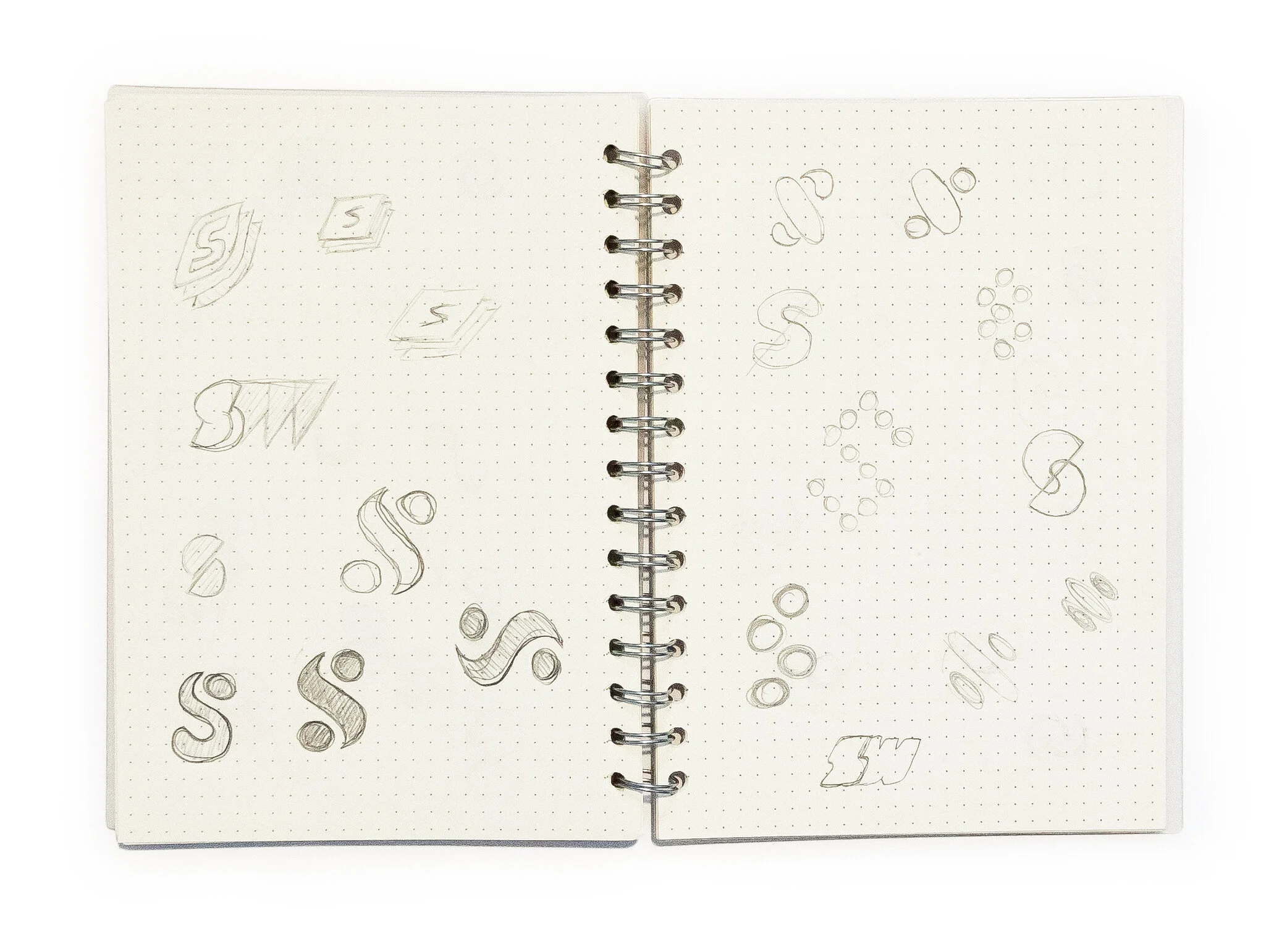
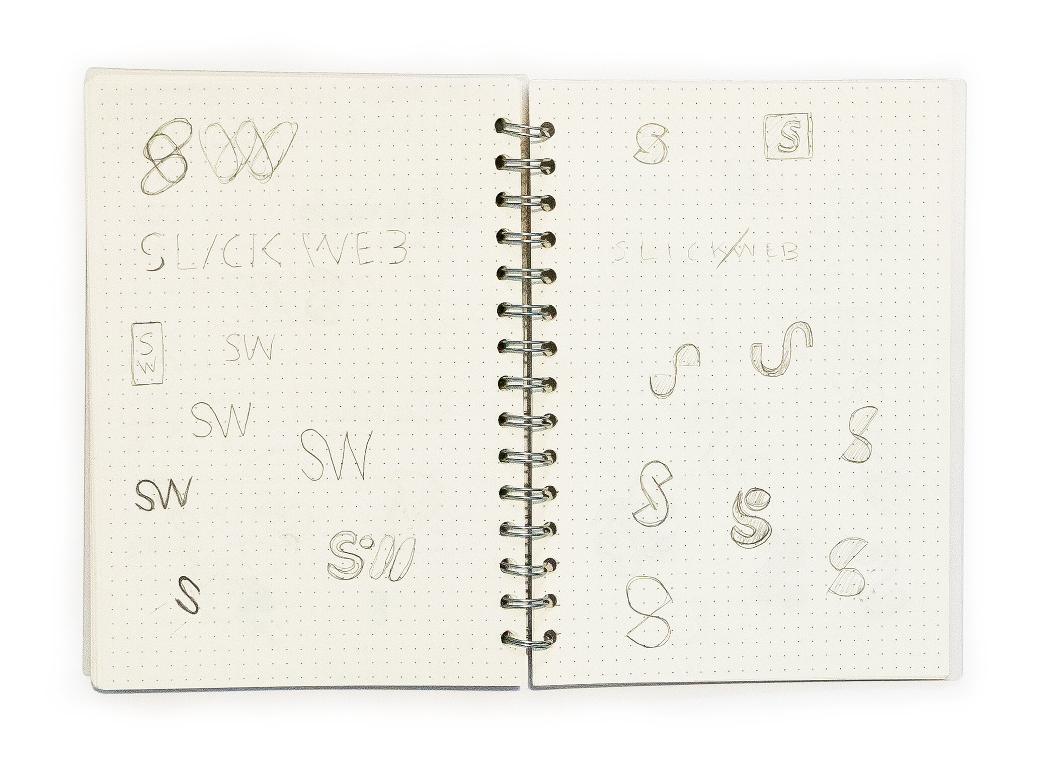

Sketches of the logo as I developed my concepts
Before and after
Here is the original logo on the left, and the new design on the right. I retained the purple colour scheme to keep some consistency for the company’s new look. But other than that it is entirely brand new.


Powerpoint presentation template screens

Desktop website: About
PROJECT TAGS:
More projects like this

The Office Sutherland

Tomi Björck
Want to work with me?
If you like this project, then say hello and let’s see what I can do to help you.
