

- CASE STUDY -
Zone Maintenance iPad app
I redesigned a Windows application built for servicing heavy mining equipment to work for iPads.
Client: Equipment Management International (Australia).
Learn more about the app here, and see it on the App Store here.
Designed remotely from Perth, Australia, 2018.

About the project
Equipment Management International is a Tasmanian technology company. They have a suite of software products designed for the mining industry to help large companies run their businesses more efficiently.
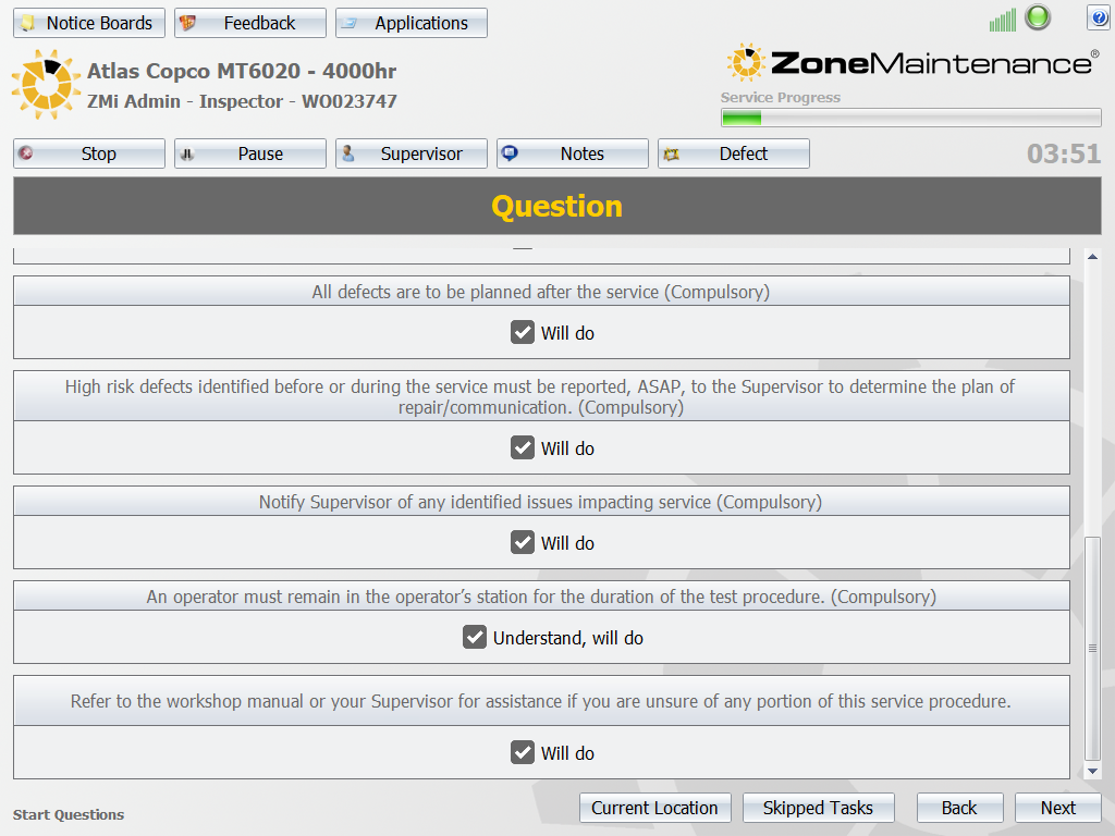
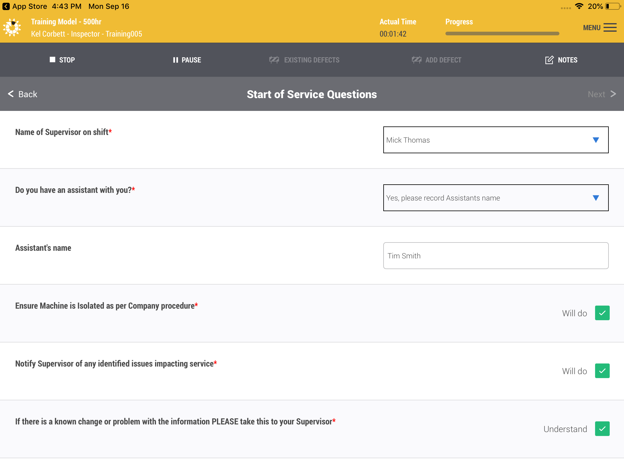
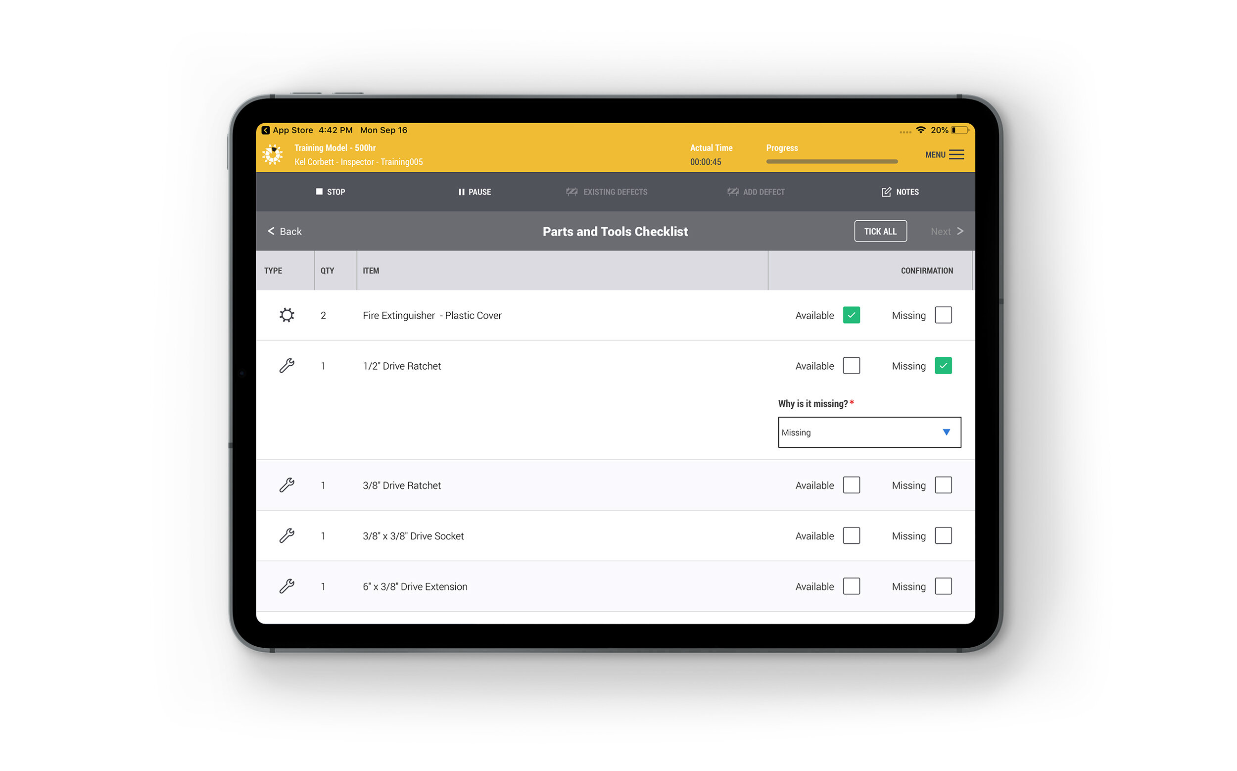
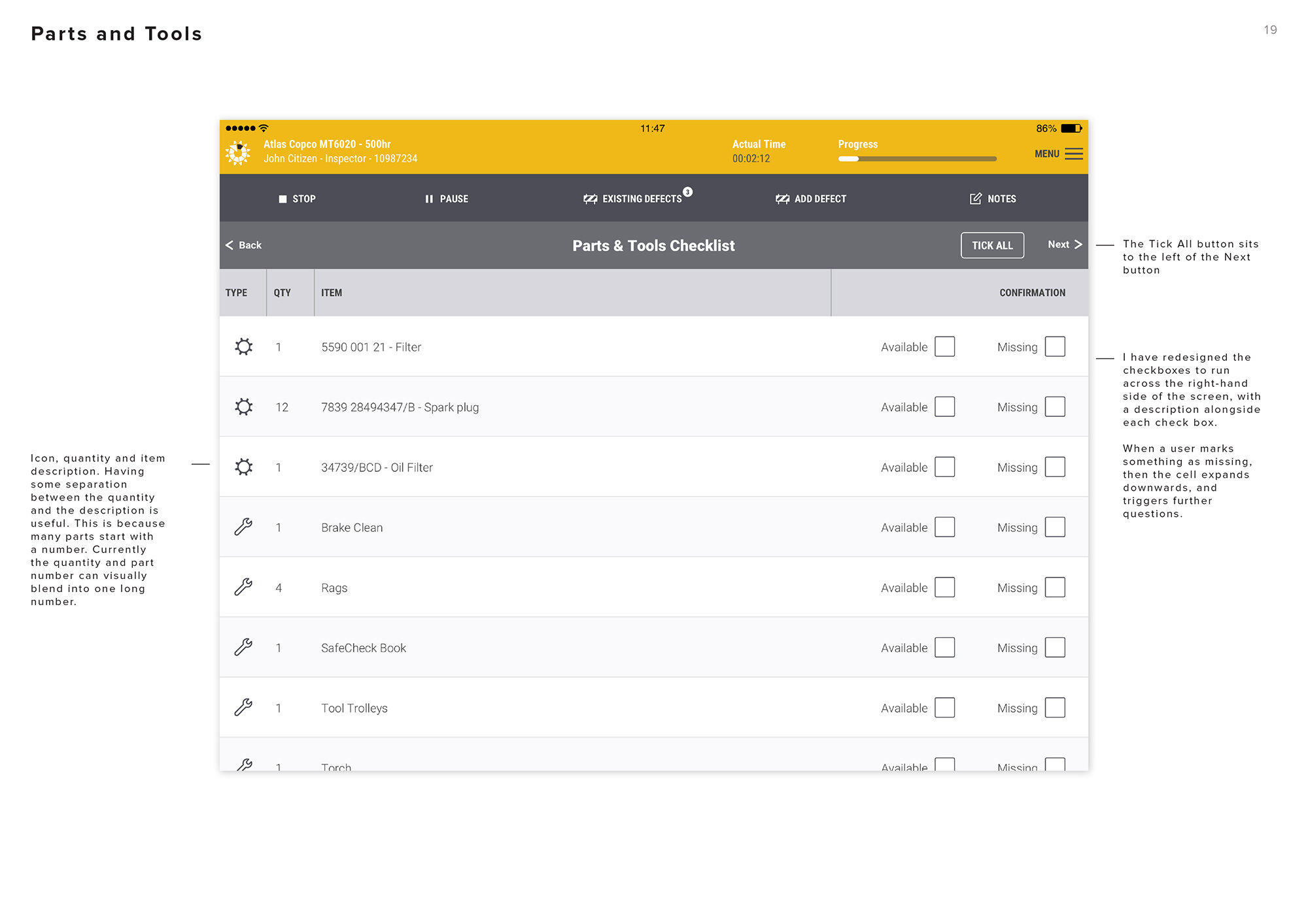
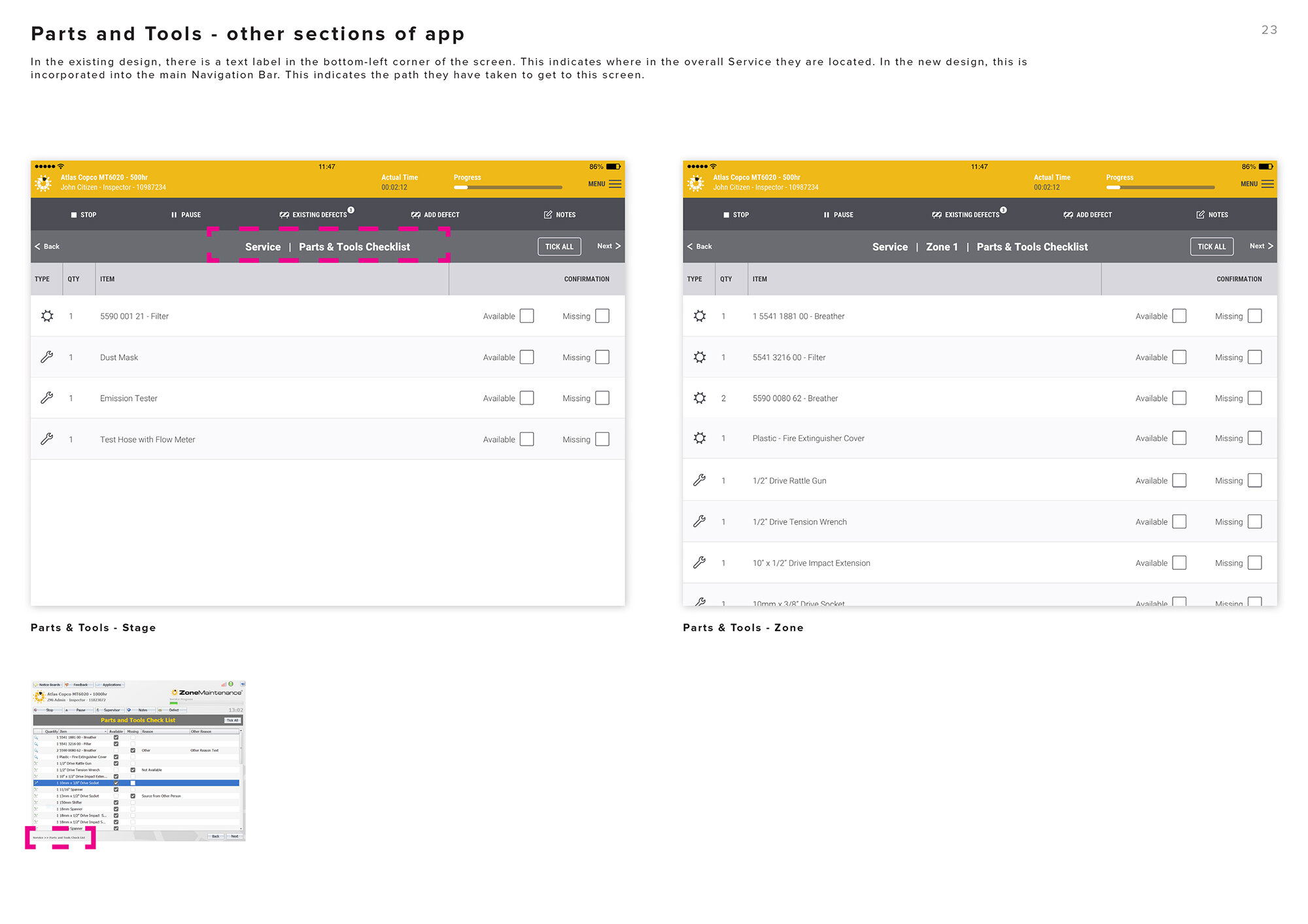
In 2018 I was approached to redesign one of their core products – the Zone Maintenance app. It is designed to provide a repeatable, time-tracking, auditable process for mechanics to service heavy duty mining equipment. It provides processes to follow, equipment and tools needed, safety information, as well as the ability to record defects and technical data (diesel engine idle RPM, etc).
Zone Maintenance was already fully functional on Windows tablets, however several clients had requested to run the app on iPads instead. In redesigning the app for iPads, I was asked to take a ground-up approach, re-examining every part of the workflow. Functionally the app was meeting the client’s needs, but they were aware that some parts of the user journey were a little clunky, and the existing design looked quite dated. They wanted to address these points, whilst also ensuring we adhered to iOS design guidelines.
Before and after
Use the slider to drag left-to-right across the image above. Dragging the slider completely to the right will reveal my new iPad design. Dragging the slider to the left will reveal the old Windows version. The design style has been massively updated and has a more ‘iOS app-like’ feel (rather than a Windows application). Consistent icon style and use of colour makes the whole screen more cohesive. Unnecessary buttons have been removed from the main interface and placed into a collapsible menu. This helps focus the mechanic on their tasks at hand, and eliminate noise.
My role
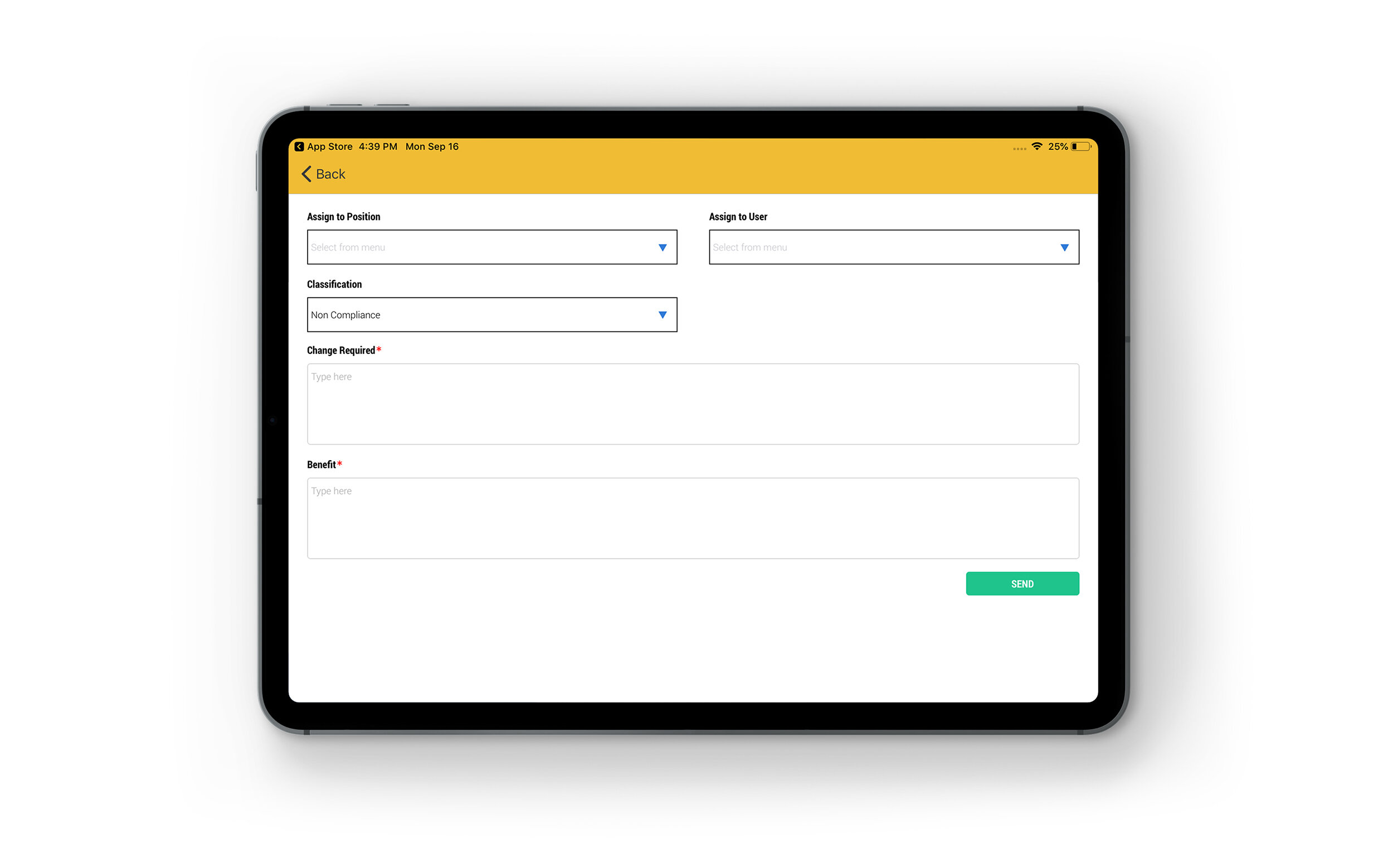
Equipment Management International has really solid mining and technical skills, but wanted this project to have more of a design and usability emphasis. To that end, they empowered me to look at all aspects of the app’s user journey and make improvements wherever I thought them necessary. I conducted extensive research, designed all key screens of the app, and worked closely with the app developer to provide him with all the necessary design assets to successfully build the app. The research helped identify an overall visual style to pursue, as well as helping to inform choices about colour, icon and typographic styles.

Above: Red is used throughout the app to draw the user's eyes to defects, danger/hazards and error states
My approach
I was working remotely from Perth, whilst the client was based in Tasmania. To kick the project off we scheduled video calls to review the existing application, and work out a design brief for the new version. I put together a lengthy research document showcasing other app and web interfaces for similar industries, paying particular attention to the use of colour and how it was used to denote warning and safety in industrial apps.
We then split the main work into two phases. For the first phase I designed 3 sets of concepts, each consisting of 5 key screens. I explored using the branded colour prominently in the app – which we could use to differentiate each of the additional products the company makes (ie, use the key colour from the logo as the highlight colour in the app’s UI.) Another approach was to strip out the colour almost completely, and use colour highlights on buttons, dialogues and icons to really hone in on danger and safety warnings.
The client chose the idea of using the branded colour prominently in the headers for each different product. With this in mind I designed the remaining ~30 screens of the app for phase 2 of the project. We approached this in small chunks, reviewing as we went. The client was highly involved throughout the whole process.

Early design concepts: Here you can see two of the early concepts from phase 1.
The one on the left uses different buttons styles, layout and fonts. The one on the right is the version with colour stripped right back. You can see in the final version, the above two layouts were jettisoned, in favour of combining the task menu and task details into a single view to improve efficiency.
D’oh!! Can’t tap that
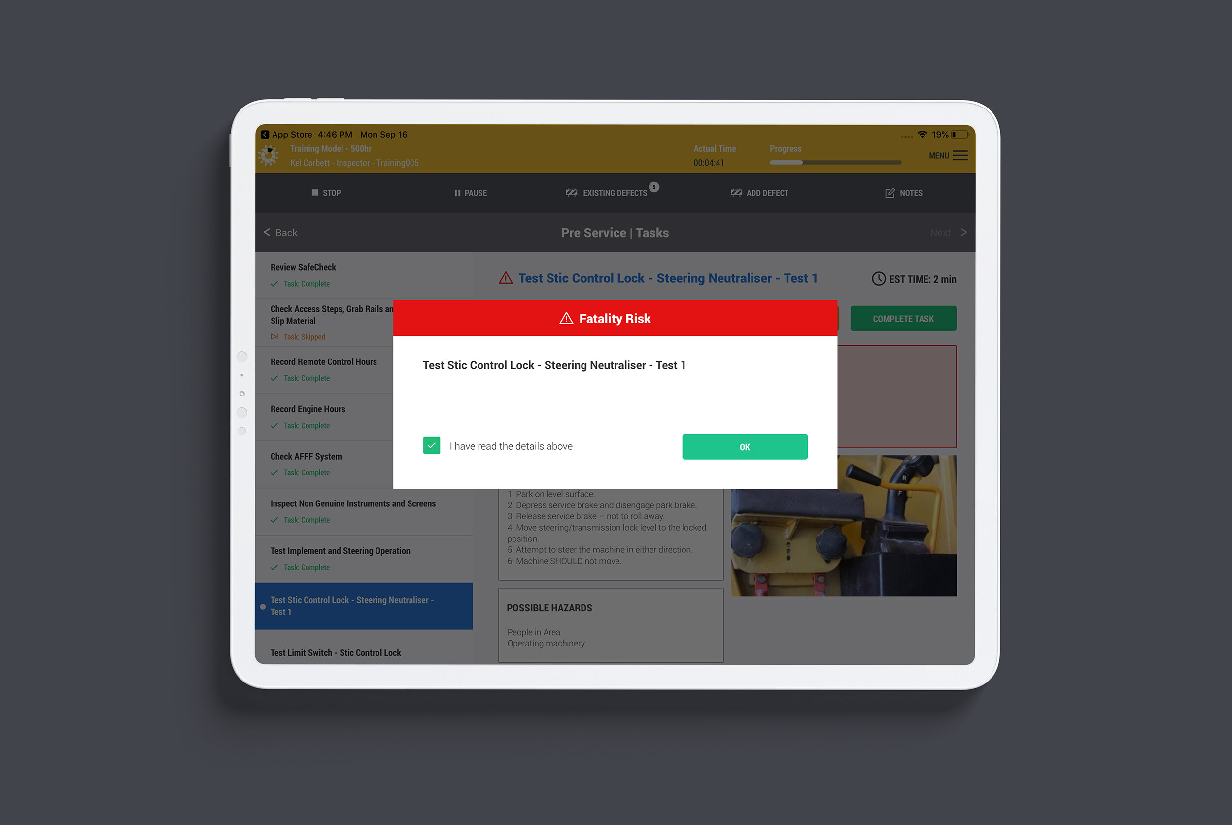
The project presented a number of challenges. One of the first I identified was the difficulty presented for a mechanic to use an iPad whilst they are servicing mining machinery. Mechanics are often men, and may have large hands. They could be wearing gloves, and their hands are likely covered in grease (the iPads are housed in heavy-duty cases). We experimented with different fonts sizes, spacing and button sizes to make sure that all interactive elements were large and easy to tap. Homer Simpson would appreciate the effort!

A famous Simpsons scene: “The fingers you have used to dial are too fat. To obtain a Special Dialling Wand, please mash the keypad with your palm now.”
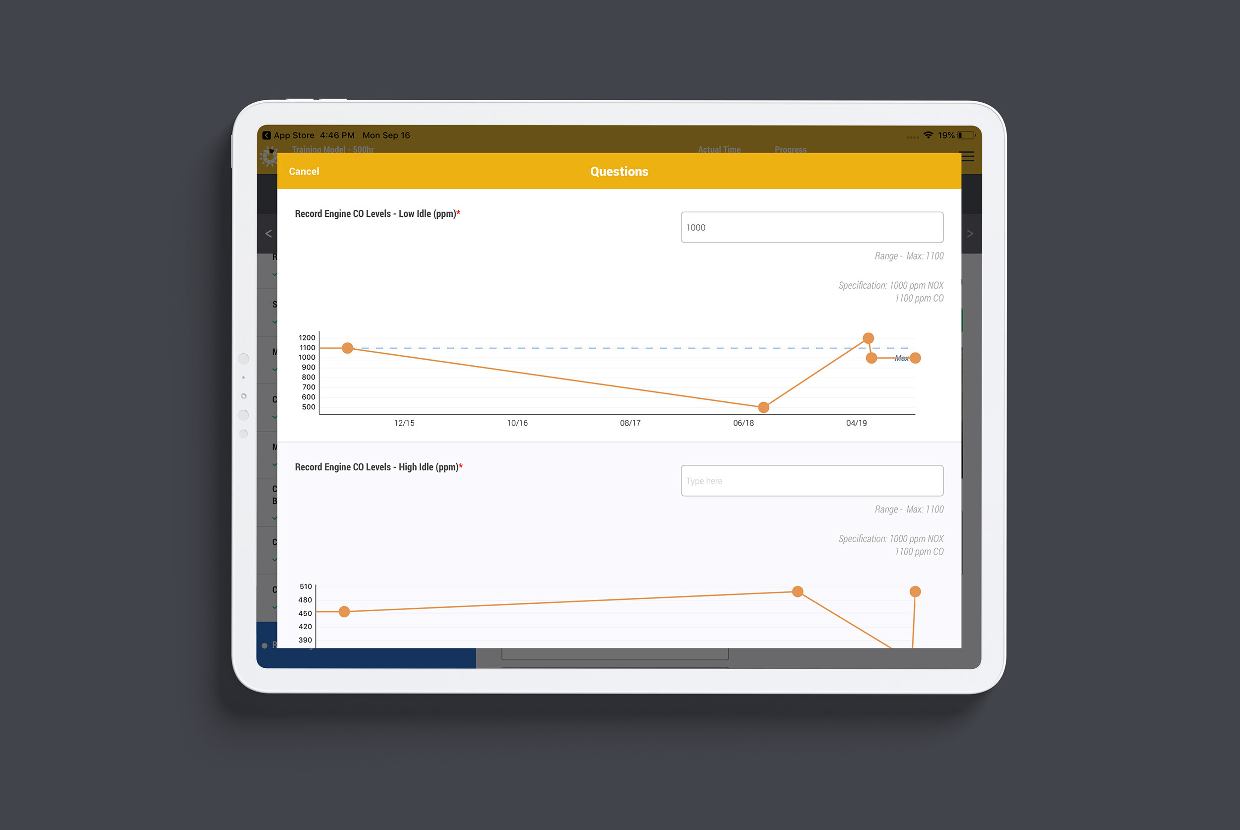
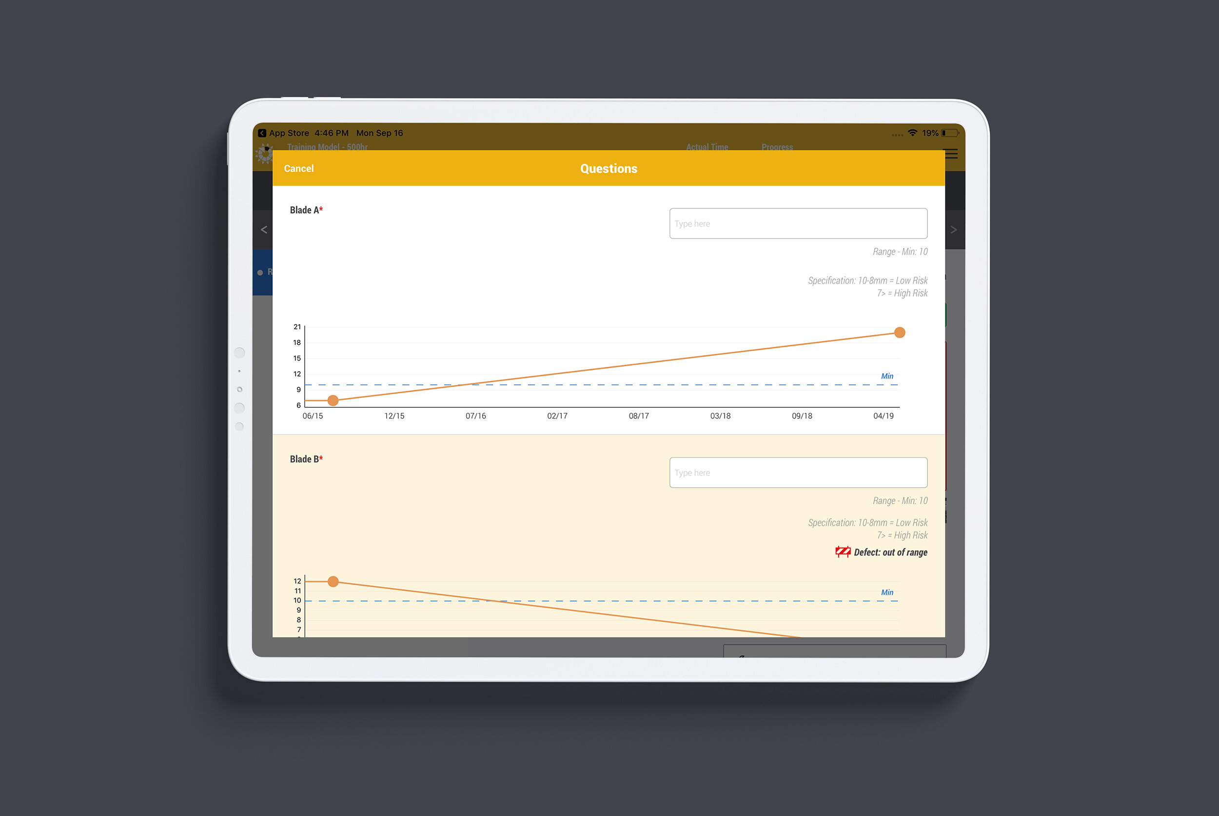
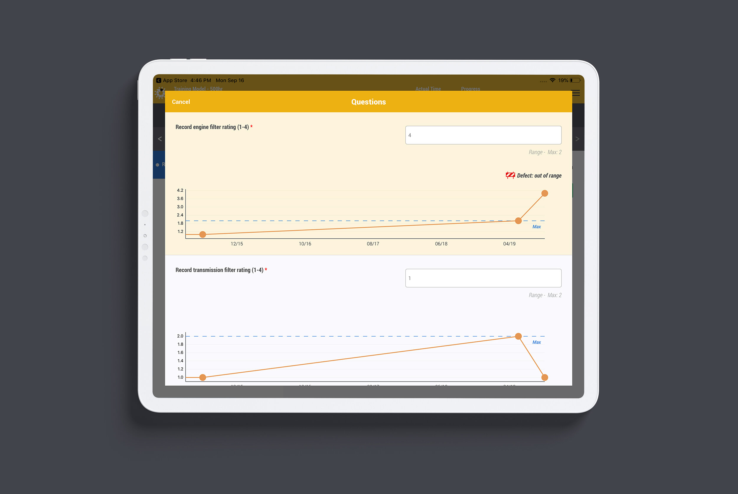
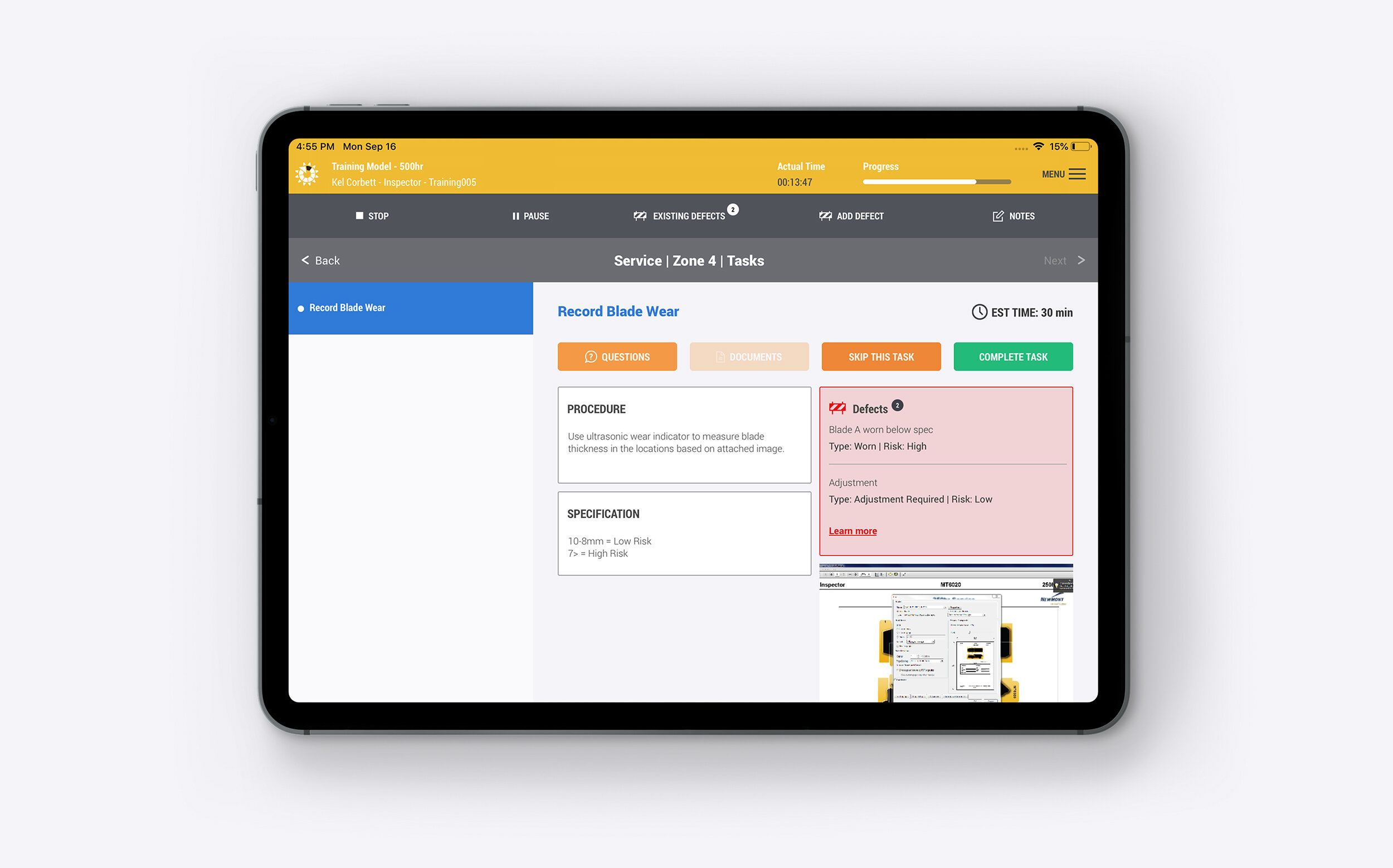
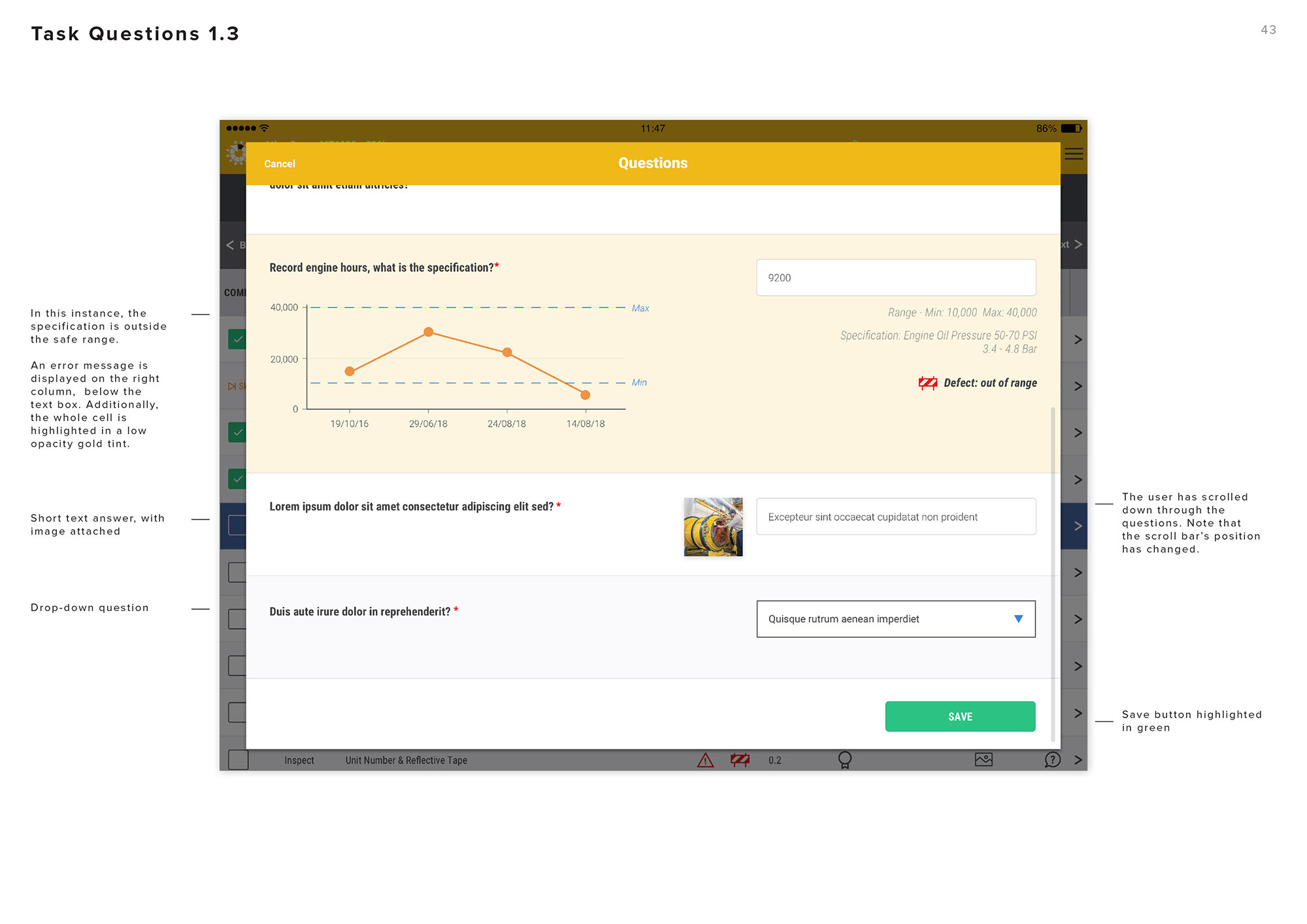
Above: Mechanics are routinely prompted to record key statistics such as engine idle levels. This data is displayed inside the app in graph format, allowing them to easily track trends and fix problems early. Defects are also recorded when any of the data is out of the acceptable range.
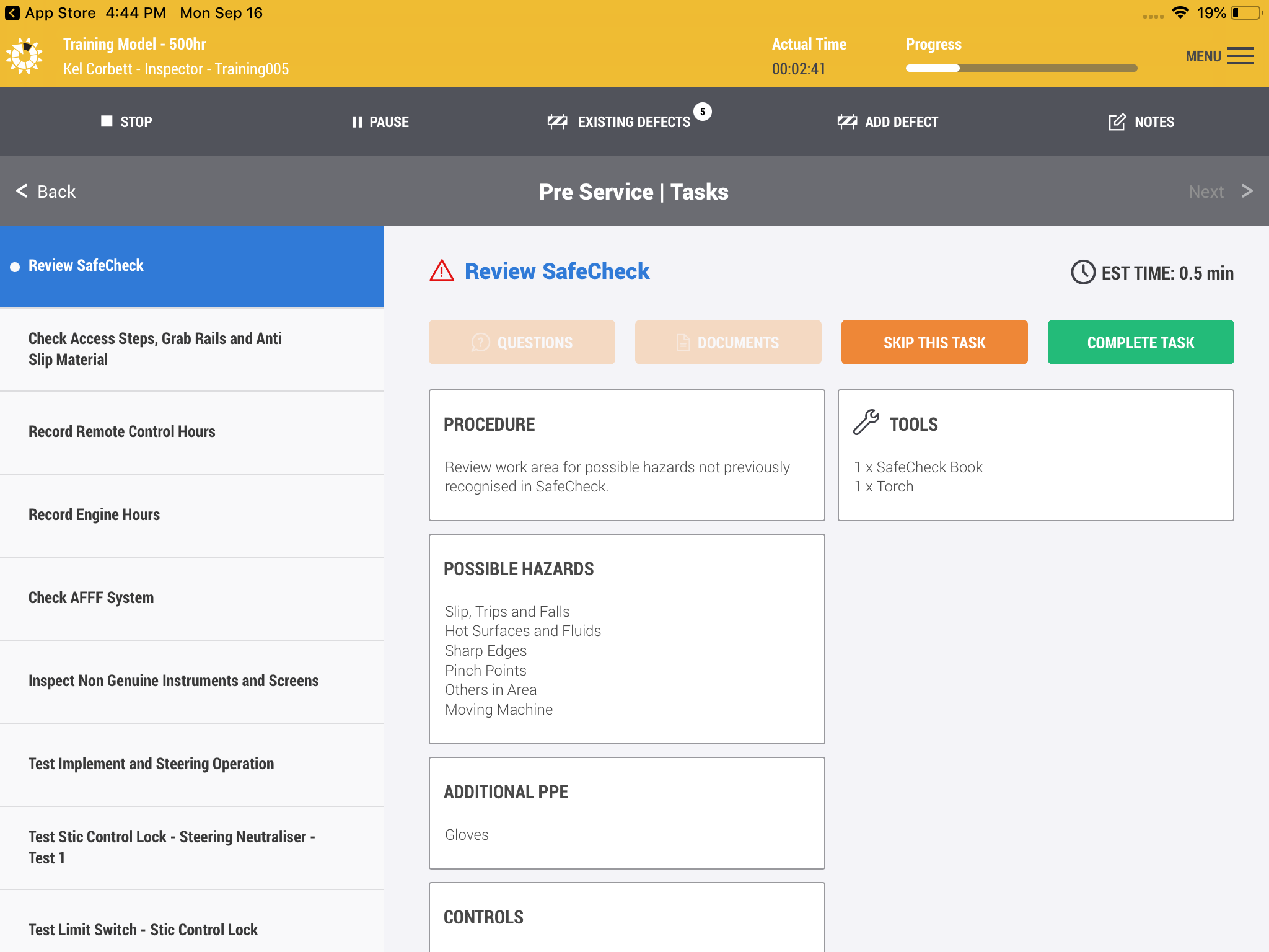
Improving usability
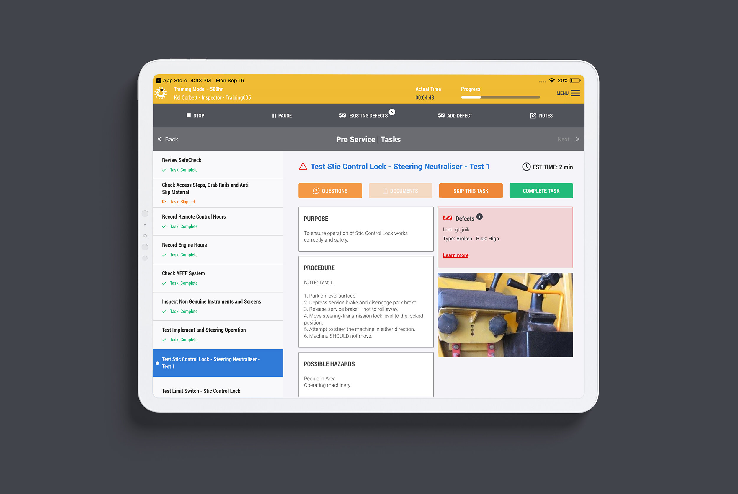
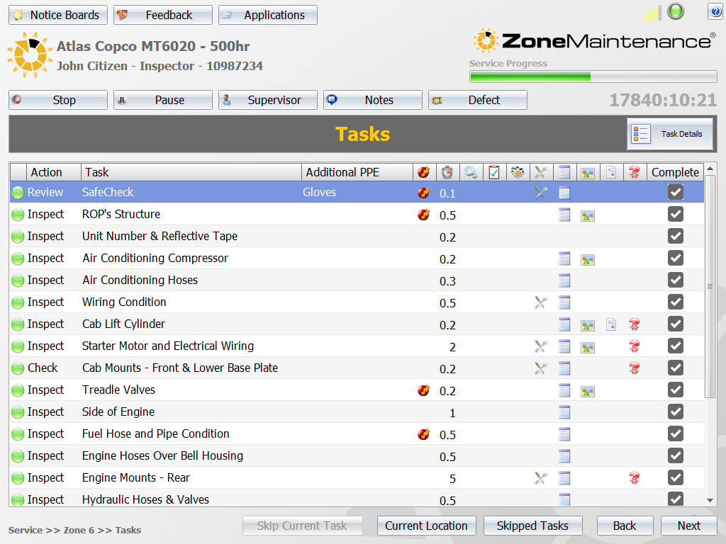
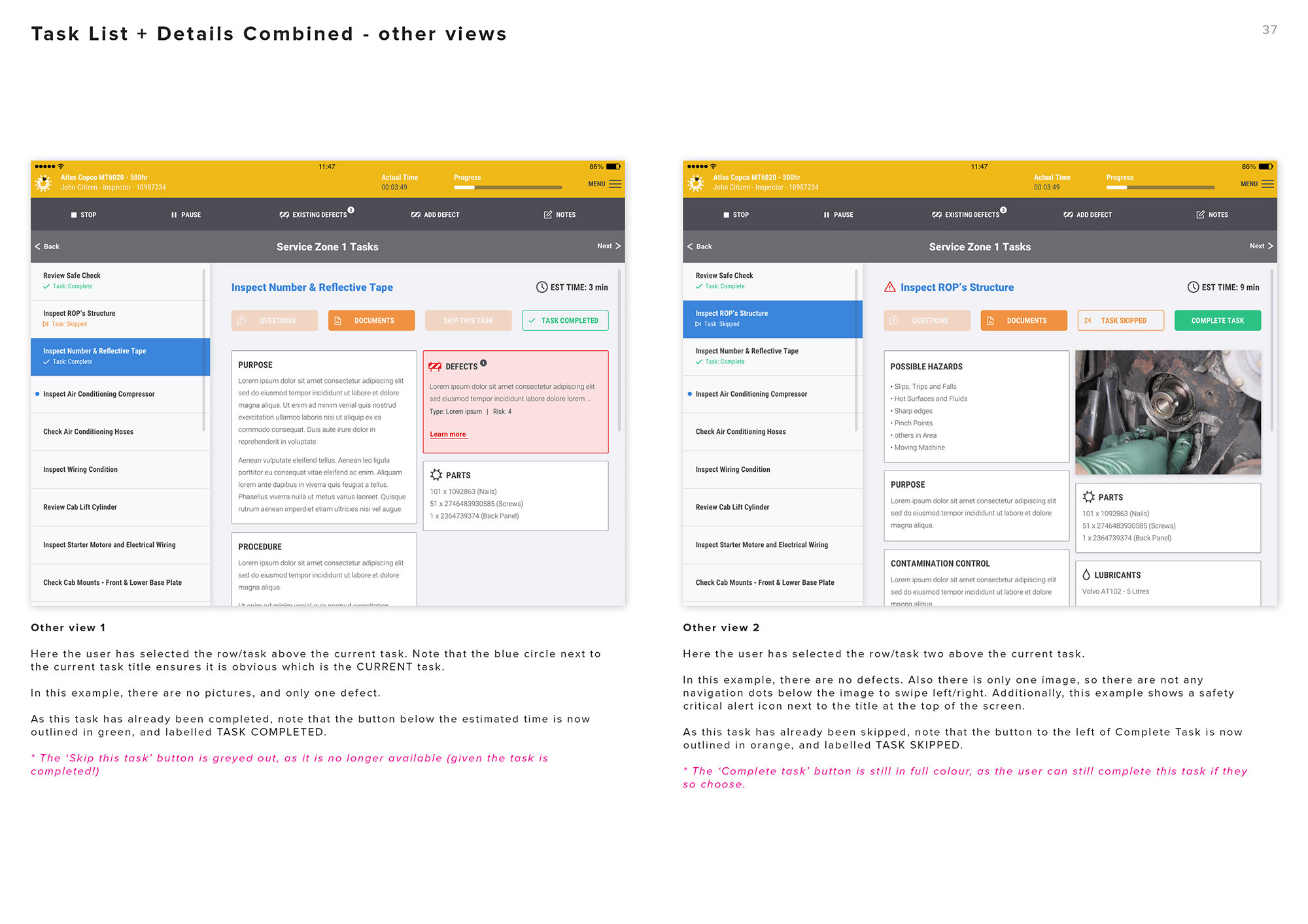
Compare the old and new designs for a task workflow above. In the old version each task is displayed in a full-width table. Icons indicate key information, but the user is forced to tap on the Task Details button in the top-right corner to find out more. This opens an entirely new view for that particular task, with all the necessary information (which is indicated by the icons in each row on the previous screen).
The new design combines these two separate screens into a single view. The tasks are displayed in a column to the left of screen, whilst all important information to complete that task is shown on the right hand side of screen. This is a huge time saver, as it eliminates the need to constantly switch between views. The mechanic can see the estimated time, safety data, documents, questions and procedural instructions all in one place. They can skip or complete this task in the one view, before moving on to the next task in the list.

Typography, colour and iconography
Careful consideration went into the selection of fonts, icons and colours. The final font family Roboto was chosen for its squat, masculine appearance. The condensed variant was especially important, as the table views that are ubiquitous throughout the app need to pack in a lot of information. The icons are all represented in single colours, with consistent use of weight and style. This contrasts strongly with the previous app’s full colour 3D icons, which quickly lost their detail when used at small sizes.
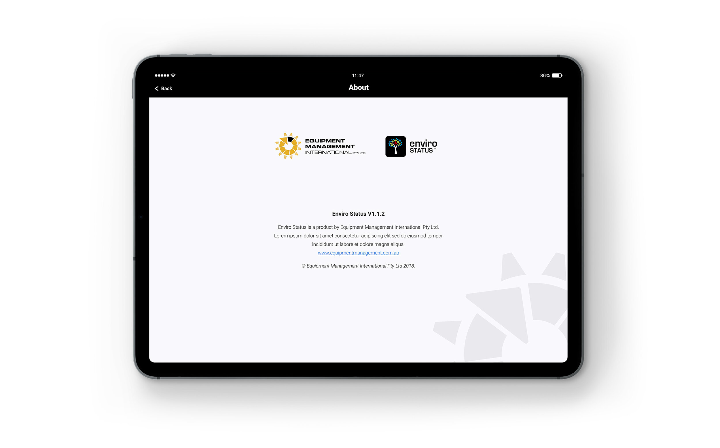
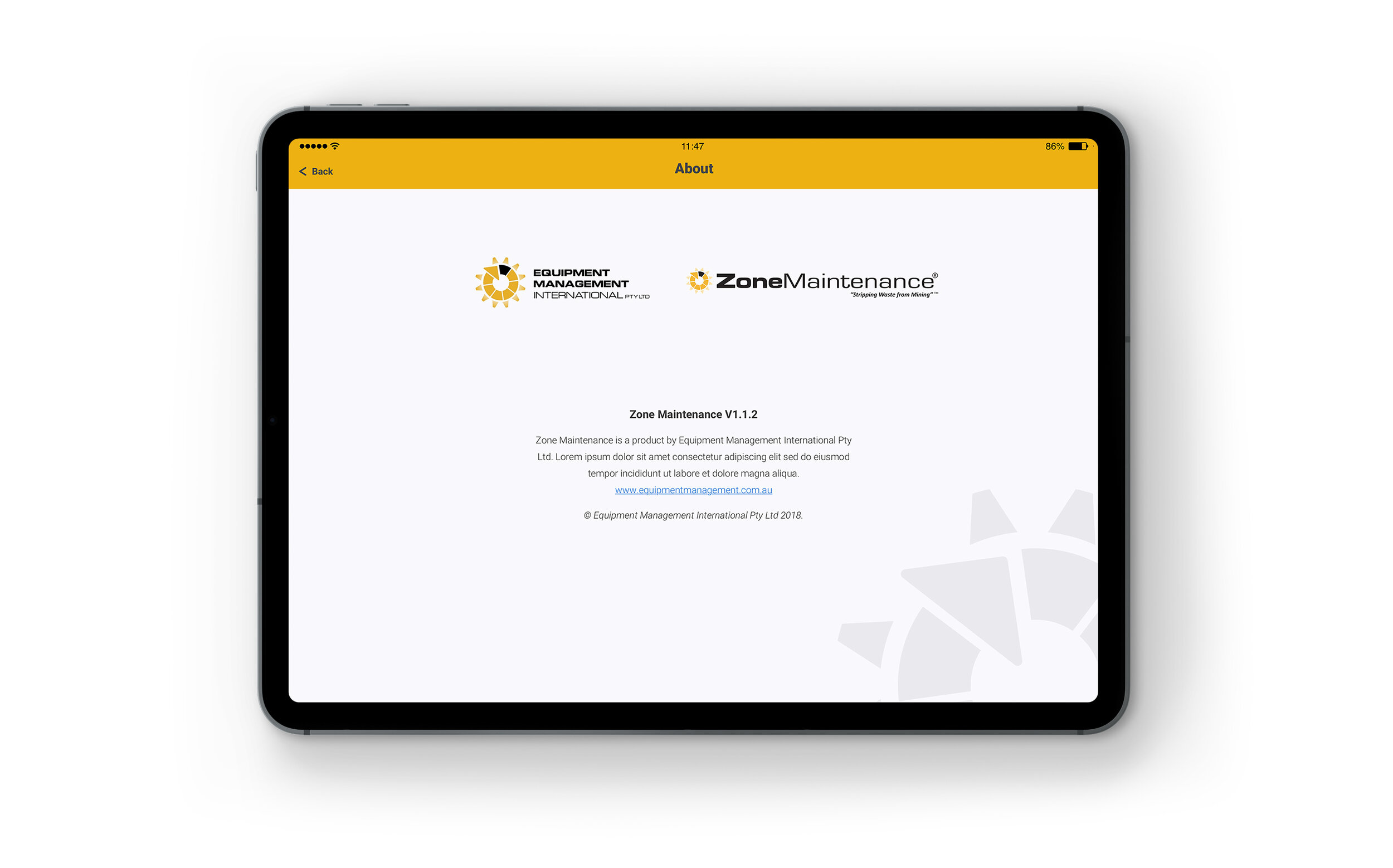
The key brand colour is used in the branding and headers for each application the company builds (e.g. yellow for Zone Maintenance, black for Enviro Status, etc). Throughout the rest of the interface red, green and blue are used for icons, whilst orange, green and blue are used for buttons and highlighting selected elements. Many of the icons were changed from full colour to neutral black. This more subdued palette is intended to use colour to place more emphasis where it is needed, particularly red to indicate warning, defects and errors. The key highlight colour used for each app in the header makes it easy for the client to re-skin each of their existing apps and keep everything consistent.
Above: Non-essential features were moved into an expandable menu to de-clutter the main interface
Designing a re-usable template
Zone Maintenance was always the focus of this project, but a key part of the brief was to make a flexible enough design that they could re-skin it to work with their suite of other Windows apps. This was one of the key reasons we stripped out most of the colour from the main interface of the app, except for key events such as errors, danger, success and selection scenarios (where we used red, green and blue respectively). This left us able to re-use the key colour from each application as the highlight colour in the headers of each of the new iPad apps (see examples above).

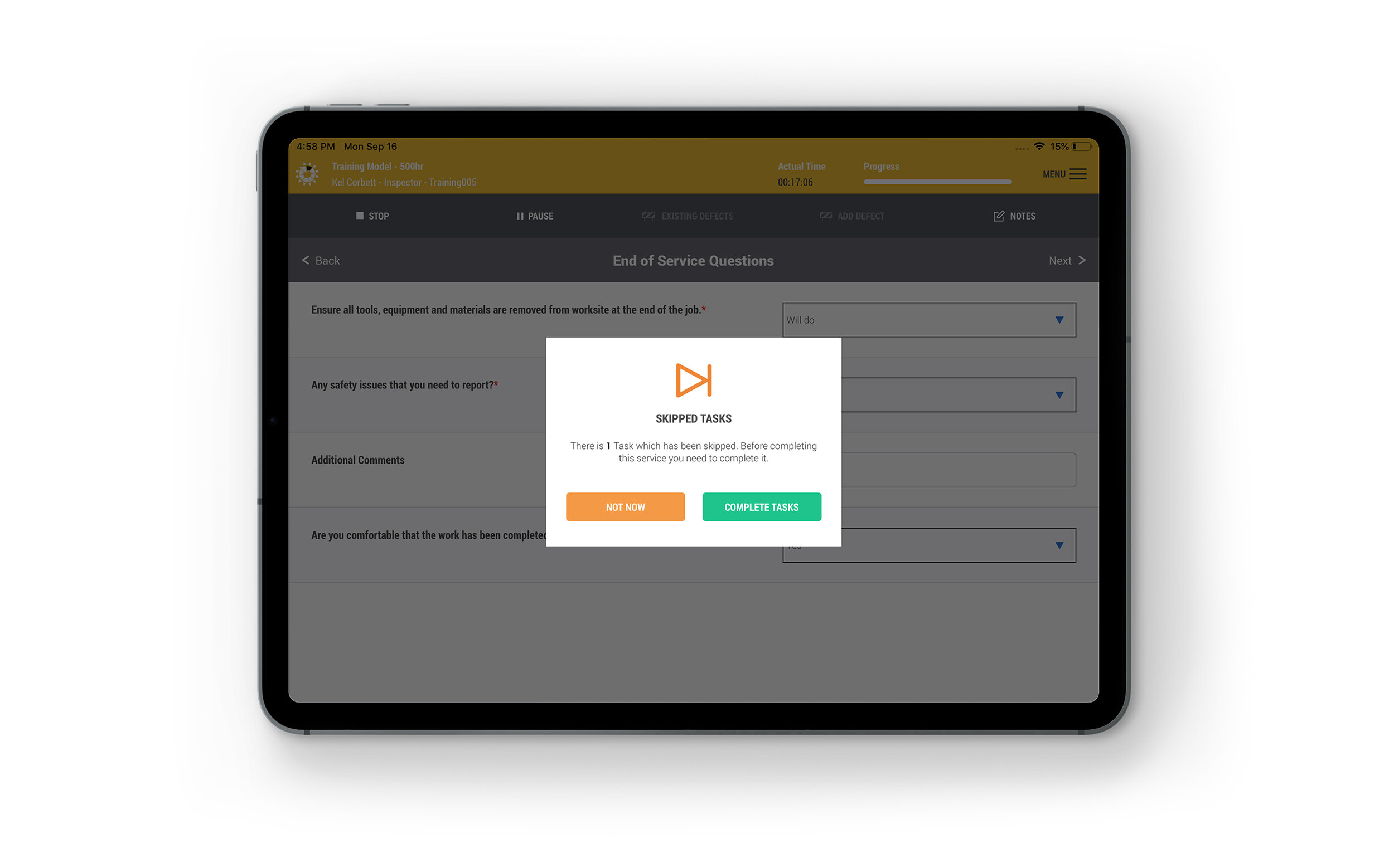
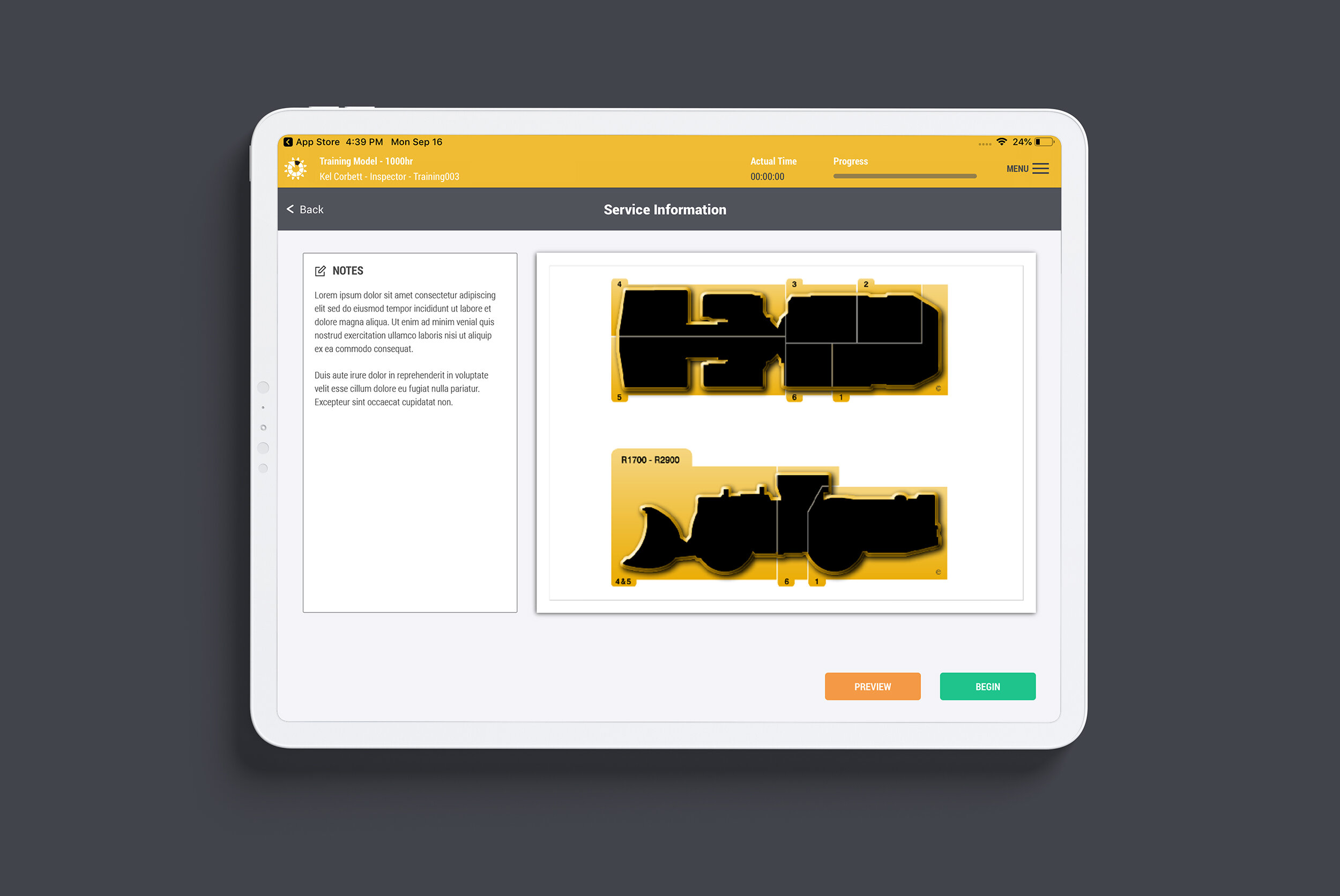
Tracking time: recommended times are displayed for each task, and the overall time is recorded for every service.
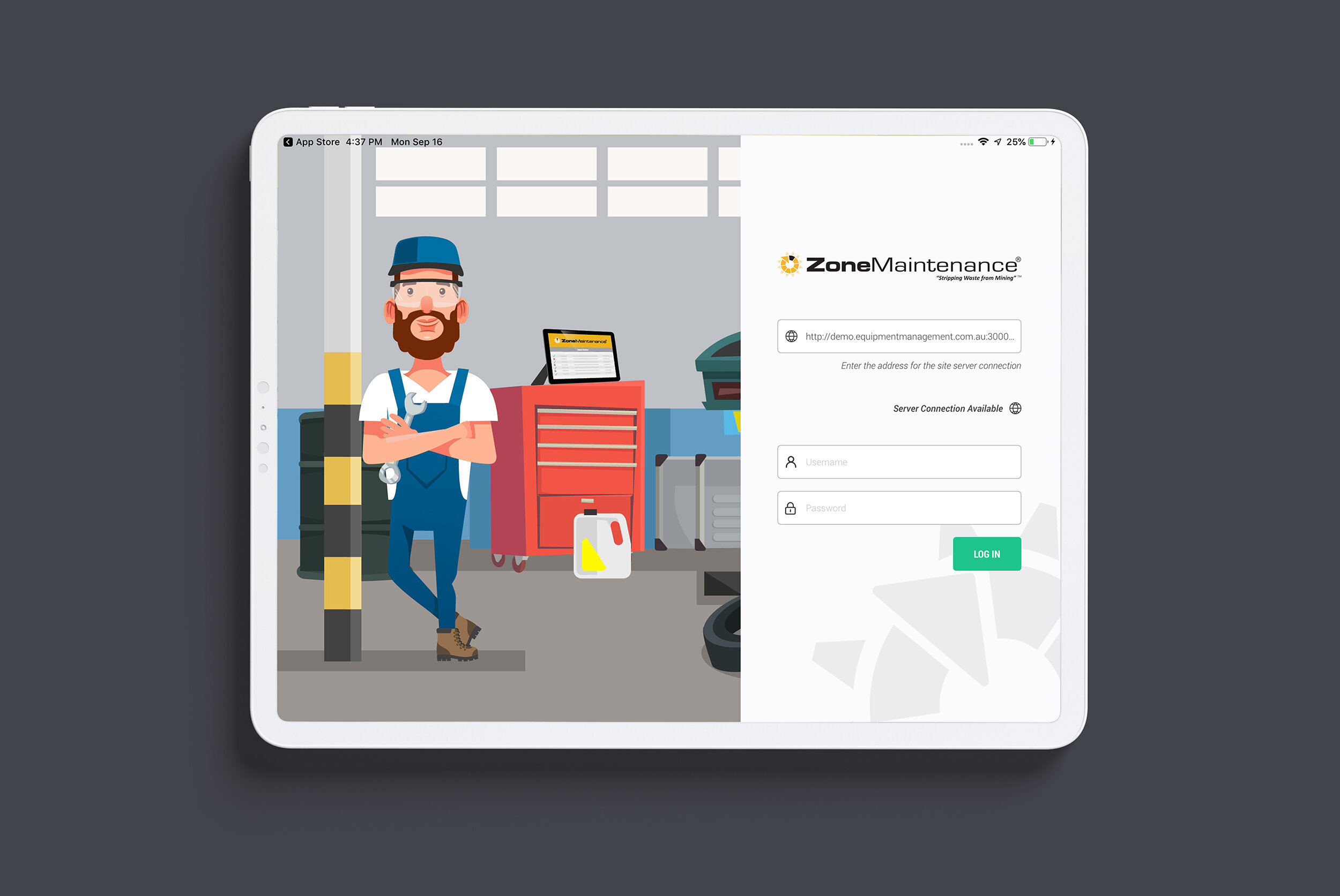
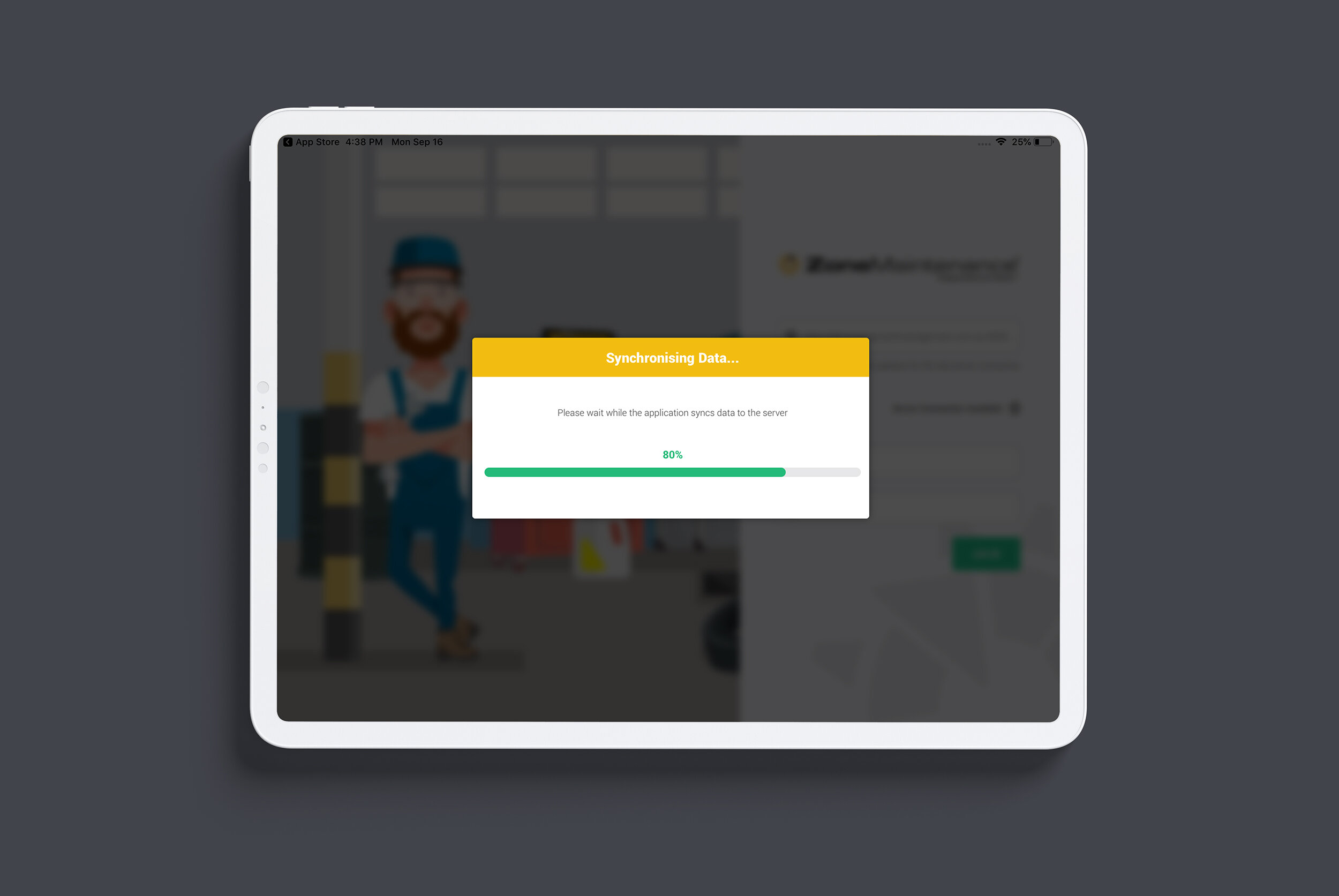
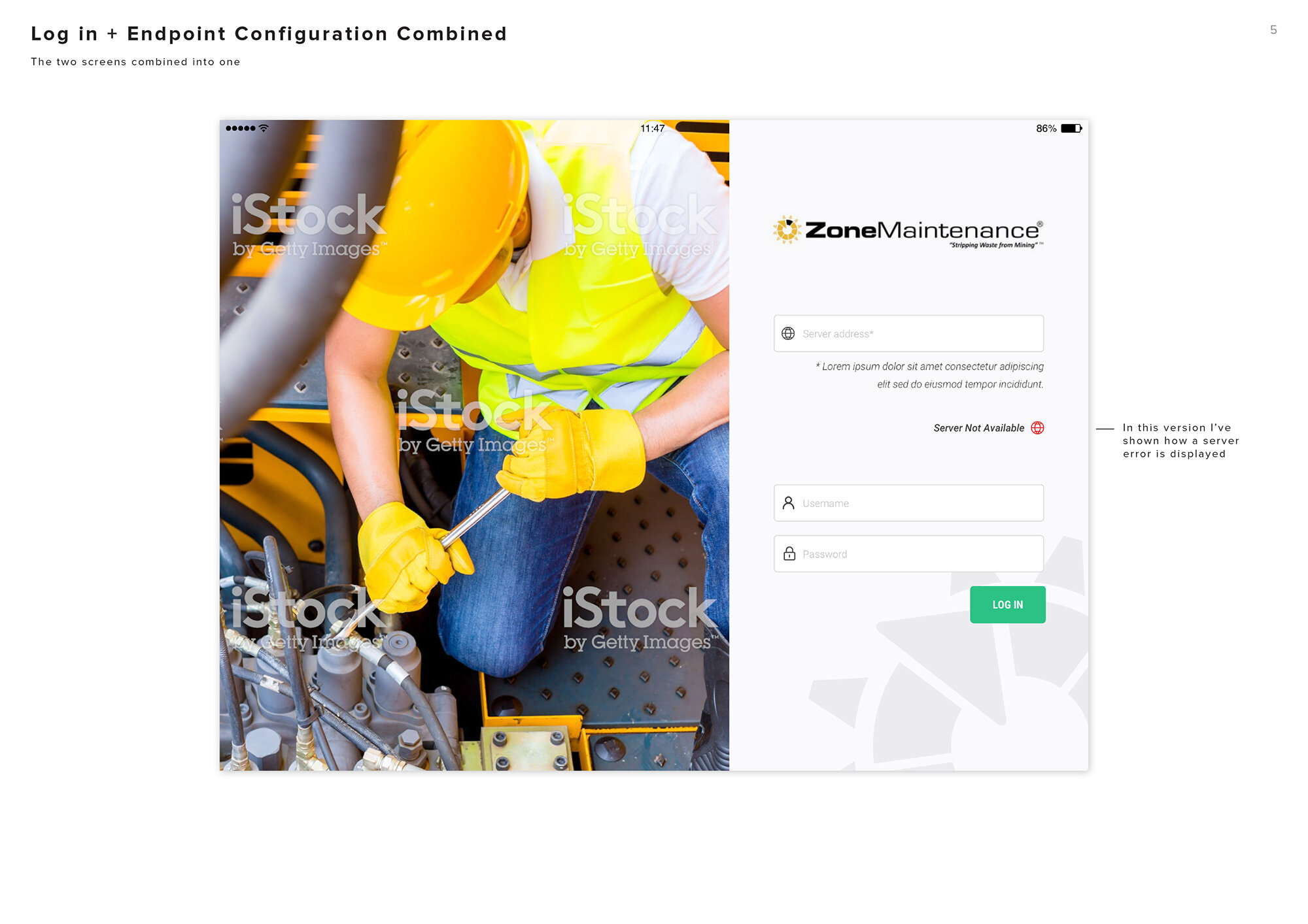
Above: The log in screen, and subsequent loading screen
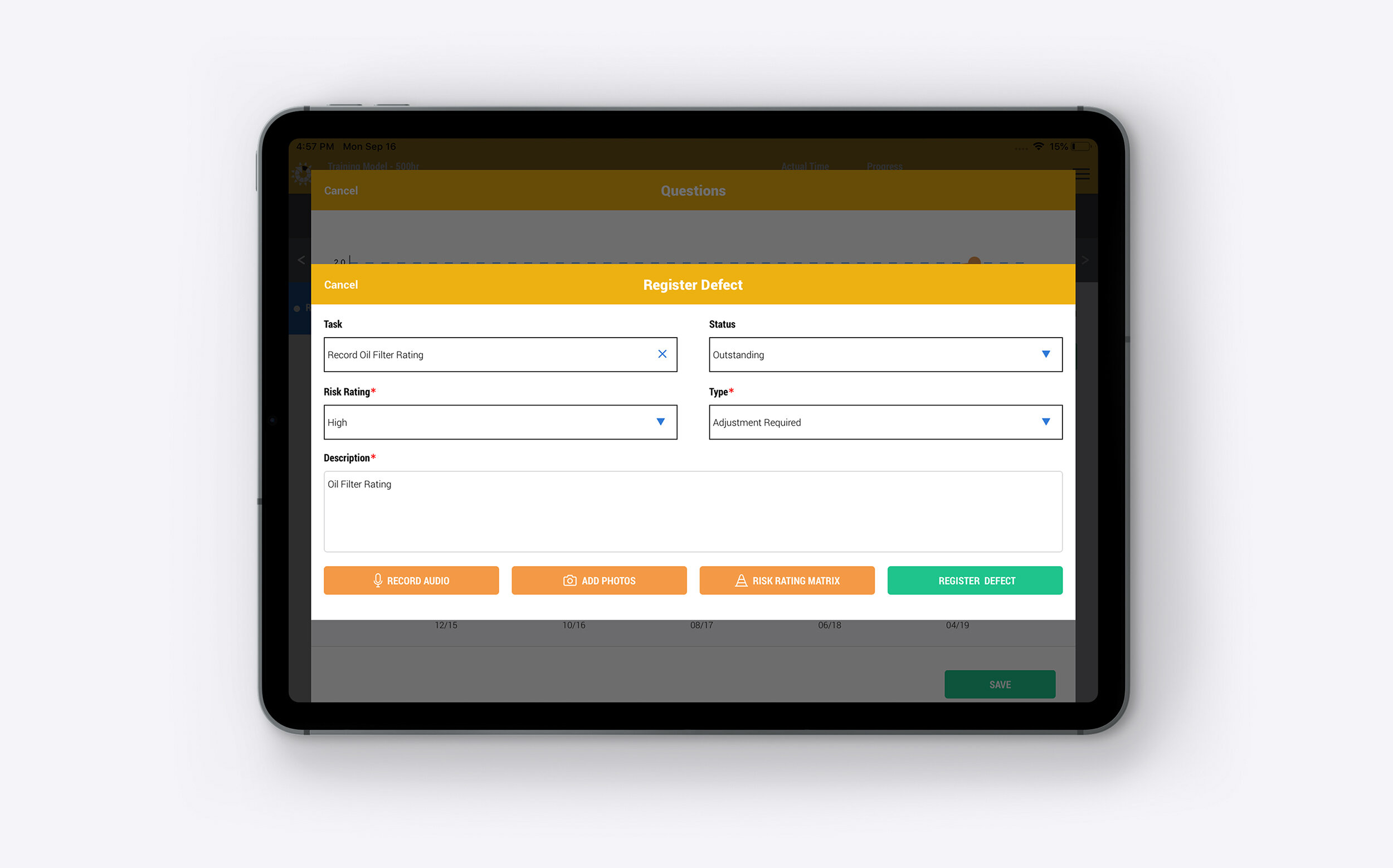
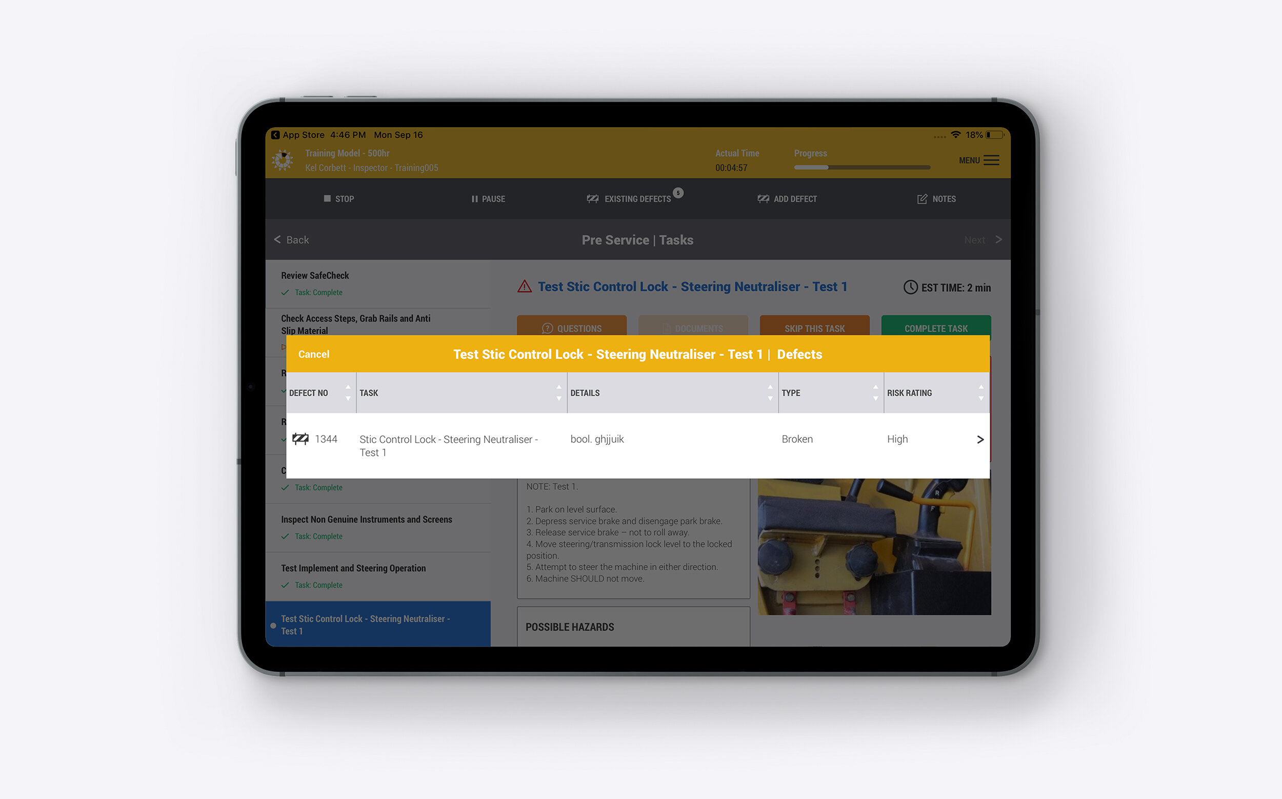
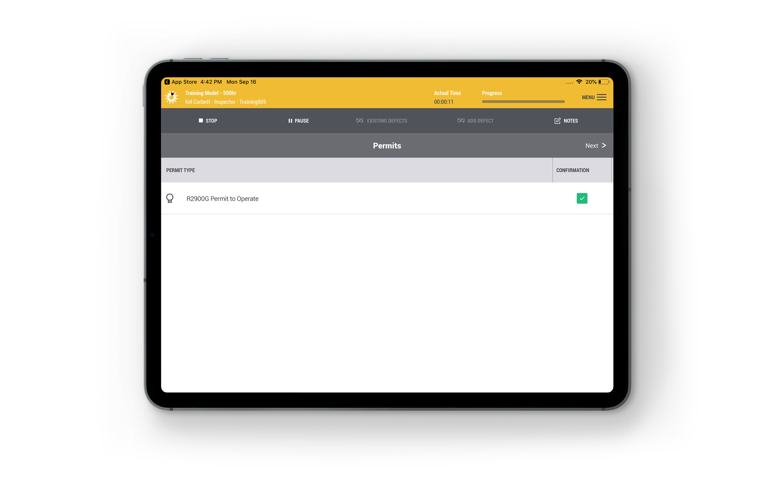
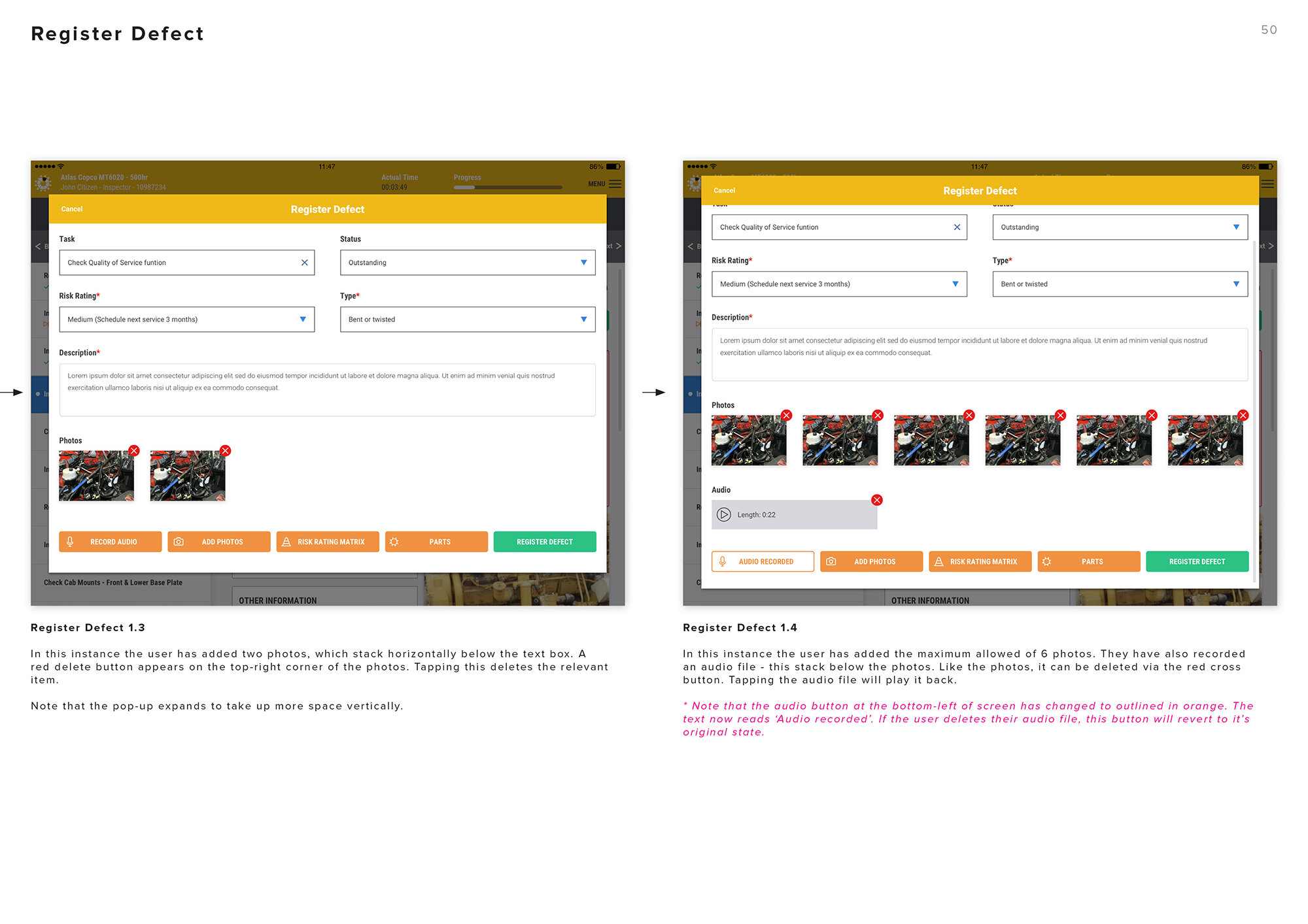
Tracking defects: Mechanics register any defects they find as they service the machinery. This allows them to be tracked over time to identify trends, and ensure any defects are known to any other mechanic who may be servicing the vehicles.
Some of the screens from the client presentation deck I designed for the app
Final thoughts
More than any project I’ve ever worked on, Equipment Management International have created a final application that looks almost identical to the prototypes I designed (see the original design concepts in my presentation deck above). The developer’s attention to detail was really impressive, and I could not be happier with the end product. The lead developer for the project was one of the key stakeholders throughout my involvement, and we established a very productive working relationship. We constructively criticised each other’s work which really helped shape how the final product looked and worked.
I believe the research really paid dividends for this project, helping to steer and inform our decisions. The client was receptive to my UX improvements, which helped make the app easier to use, as well as saving time with unnecessary navigation patterns. The project was a successful example of collaboration between design, development and business.
Since completing this project they have been migrating their other apps with this new look from Windows to iOS. I’ve been told the feedback from their clients has been positive, and I think it’s clearly a big improvement on their old Windows product. I have also been helping them design a web application to manage the iPad apps on the back end.
PROJECT TAGS:
More projects like this

CASE STUDY
Fearless app

Case study
Skavnger app
Want to work with me?
If you like this project, then say hello and let’s see what I can do to help you.
